![](https://cdn.myportfolio.com/a6f341acd4671fd4083a18cd59ca5cd0/181367c4-ad86-425a-9de1-0af6864a22e2_rw_1200.jpg?h=dcb300a95888461bc8ce1e66628af631)
![](https://cdn.myportfolio.com/a6f341acd4671fd4083a18cd59ca5cd0/b9c10fec-67d5-480d-aa40-dacf19185668_rw_3840.jpg?h=b7bf464ab6e77fca6dfd7db1d50d6408)
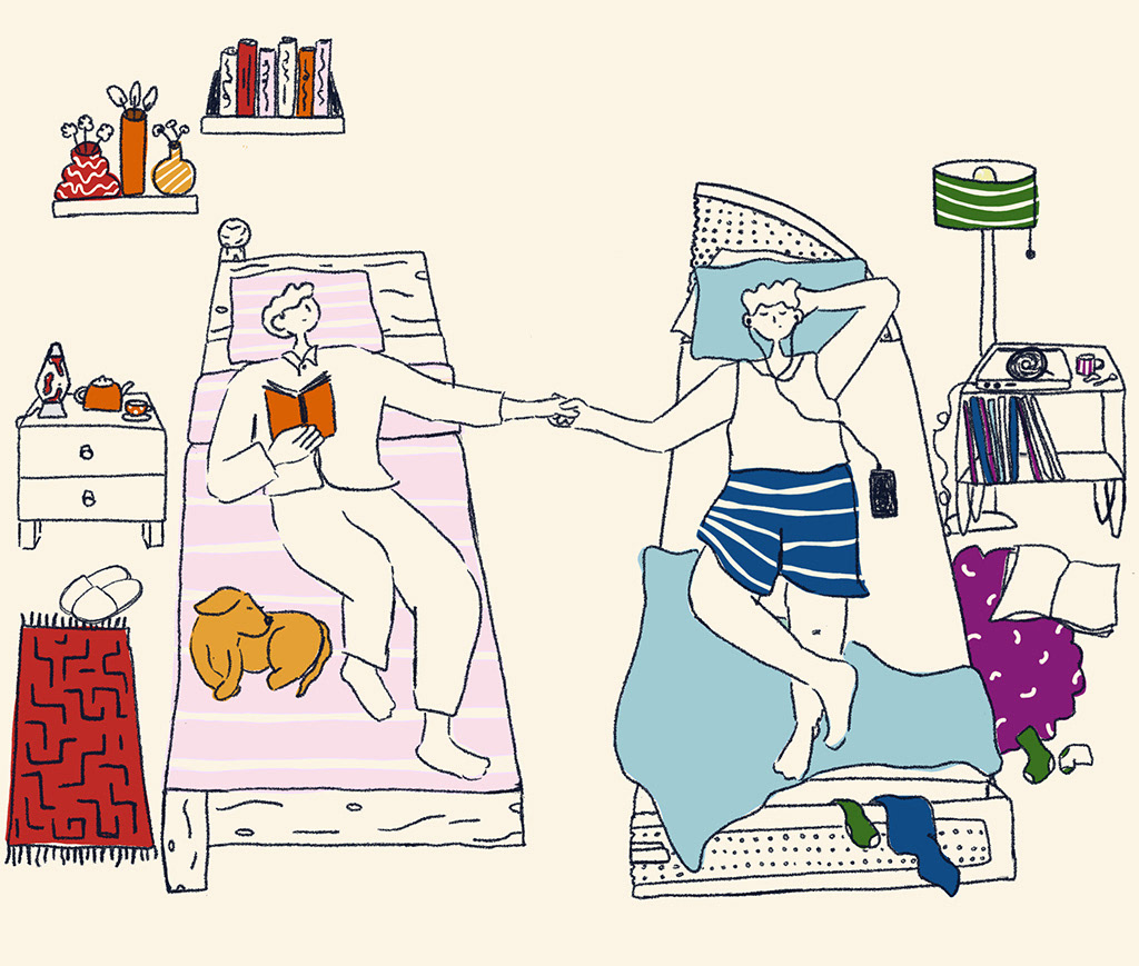
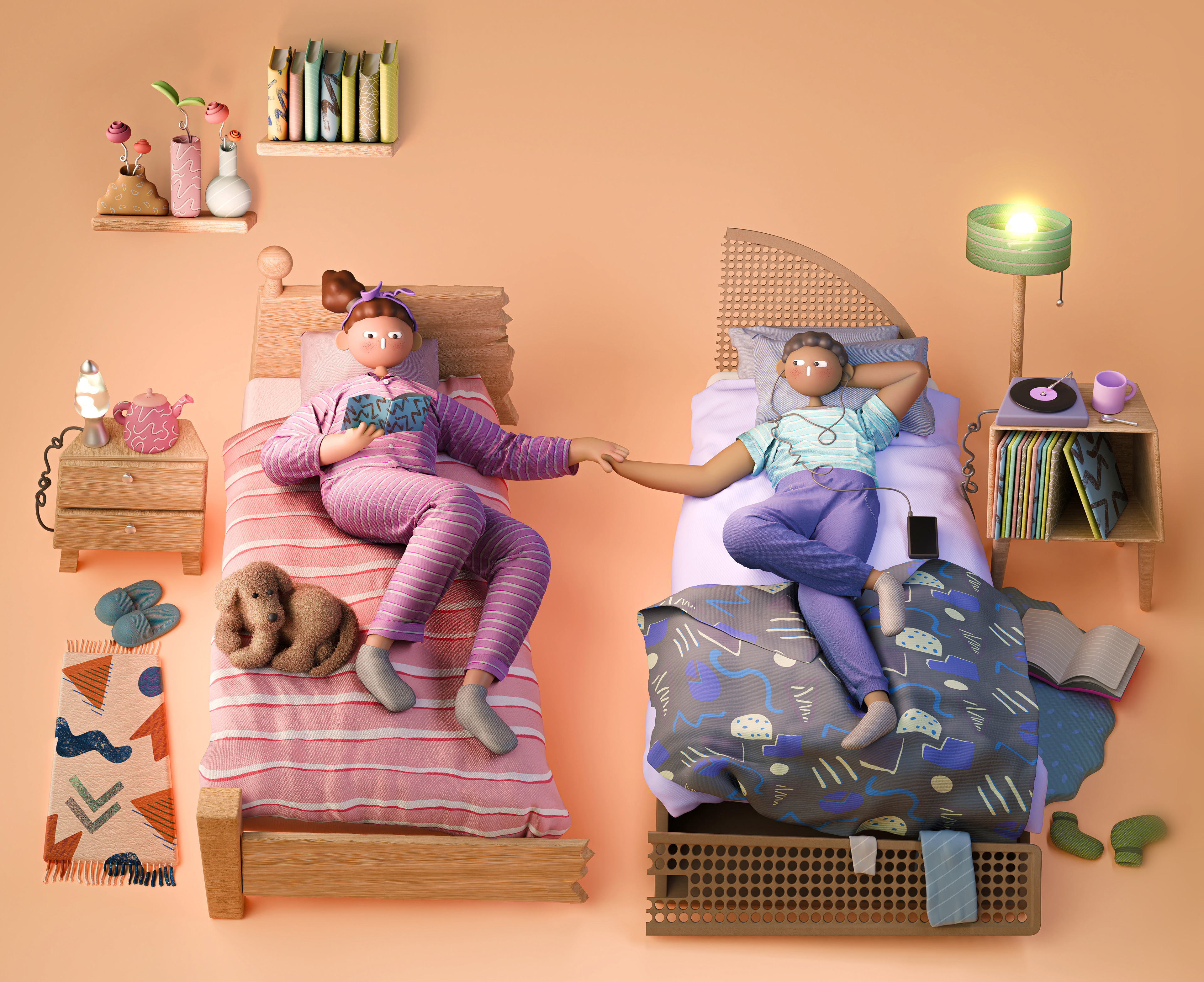
The Washington Post invited us to illustrate the cover for the Health & Science supplement, portraying their lead story on couples sleeping in separate bedrooms. We show two beds cut in half with contrasting rooms and a couple holding hands across the divide.
![](https://cdn.myportfolio.com/a6f341acd4671fd4083a18cd59ca5cd0/b455d248-e6ec-4658-9bc4-d430b8e6dcc4_rw_1920.jpg?h=6291211a522309f7f8cfbff560c380b0)
![](https://cdn.myportfolio.com/a6f341acd4671fd4083a18cd59ca5cd0/4995ee31-7cc2-4074-ab8f-0d2f6b4fcc64_rw_600.gif?h=d9b0a47979ad4624bf46c8c951deecd0)
![](https://cdn.myportfolio.com/a6f341acd4671fd4083a18cd59ca5cd0/377ce7a9-4216-4a3b-8bd6-001d329c83ad_rw_1920.jpg?h=607a4bc6ea3f7b000a3643459939f699)
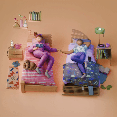
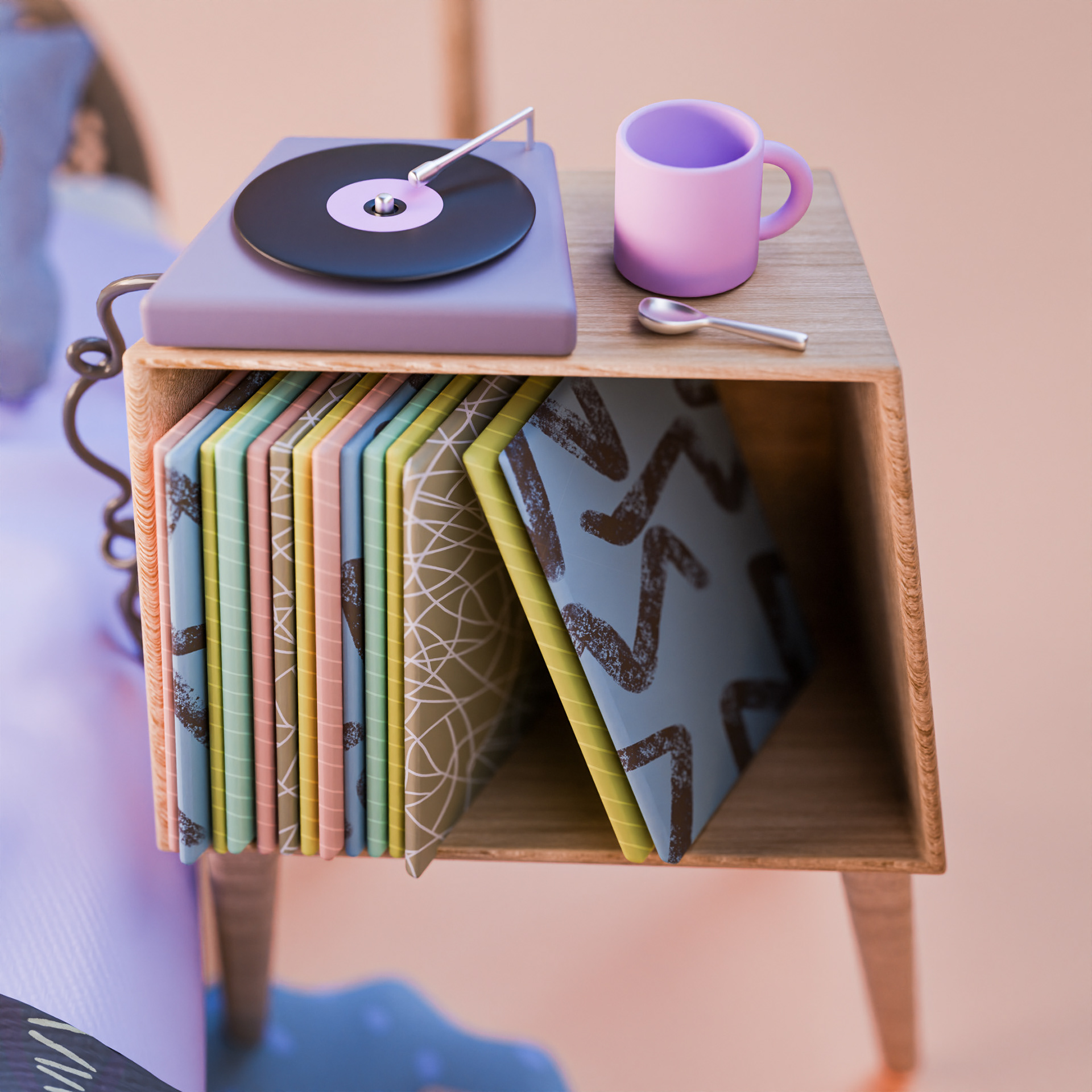
Our challenge was to create a harmonious scene but with clear contrast. The main way we achieve this is through colour; warmer on the left side and and a cold colour palette on the right. We also have contrast in the characters' level of neatness and their perceived interests, with one reading - their bedroom also includes bookshelves - and the other listening to music, complete with a record player and vinyls.
![](https://cdn.myportfolio.com/a6f341acd4671fd4083a18cd59ca5cd0/5b1a469c-dc22-4bff-b6d9-26868e89cc85_rw_1920.jpg?h=40e8f7581ff1b235143e83c11622730b)
![](https://cdn.myportfolio.com/a6f341acd4671fd4083a18cd59ca5cd0/97432343-367d-48c0-9623-e4fc4fa3397f_rw_1920.jpg?h=3a0f9fb5b8da1c3b6309675fb5da0235)
![](https://cdn.myportfolio.com/a6f341acd4671fd4083a18cd59ca5cd0/c16ab0e7-2ad7-4290-8e66-15faaabf0019_rw_1920.jpg?h=e047fc3d0a8ebffa321d921d8f1eb636)
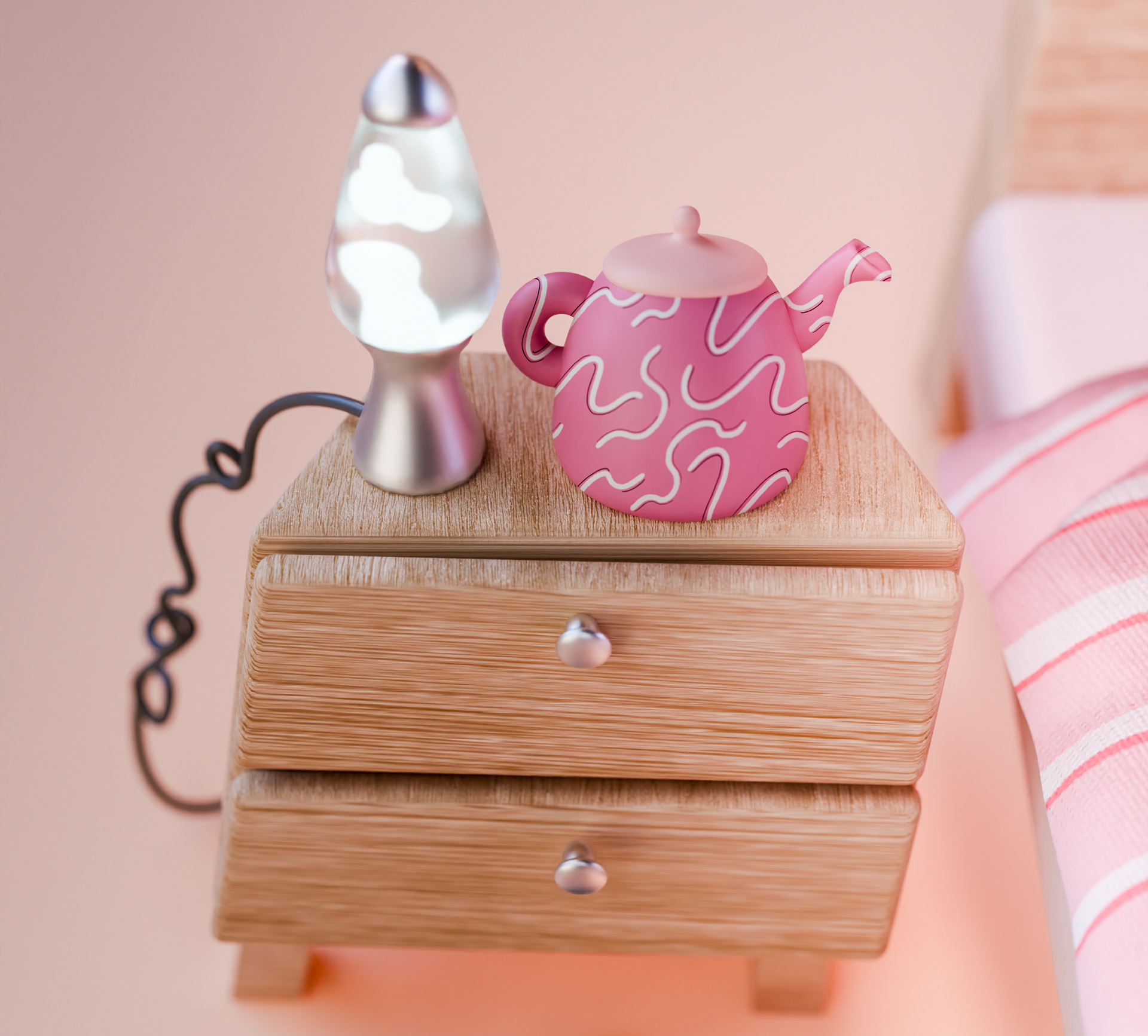
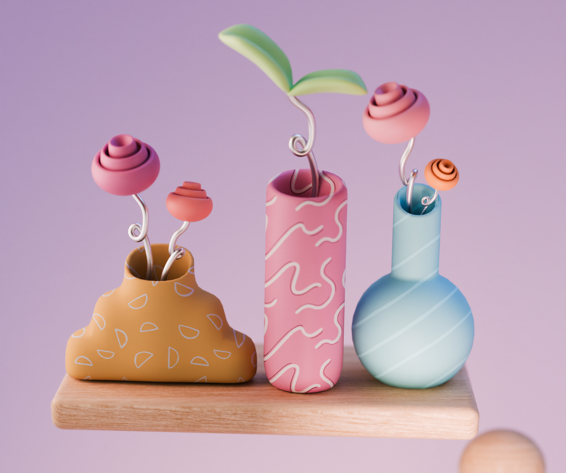
To create that sense of harmony and tie the two opposing scenes together, we use pattern as a predominant theme. Although the rooms may be full of differences, they have the same style of textures and patterns running throughout, bringing a craftiness and playfulness to the illustration.
![](https://cdn.myportfolio.com/a6f341acd4671fd4083a18cd59ca5cd0/f779cefb-0dd1-4746-88ac-65fc97ba6616_rw_3840.jpg?h=a2ff8a53c47eab0539000c0055183b6d)
![](https://cdn.myportfolio.com/a6f341acd4671fd4083a18cd59ca5cd0/fa855192-26de-4ddd-baf1-d186fc03db9b_rw_3840.jpg?h=67c49b823db34bc9b4e606f82678bd84)
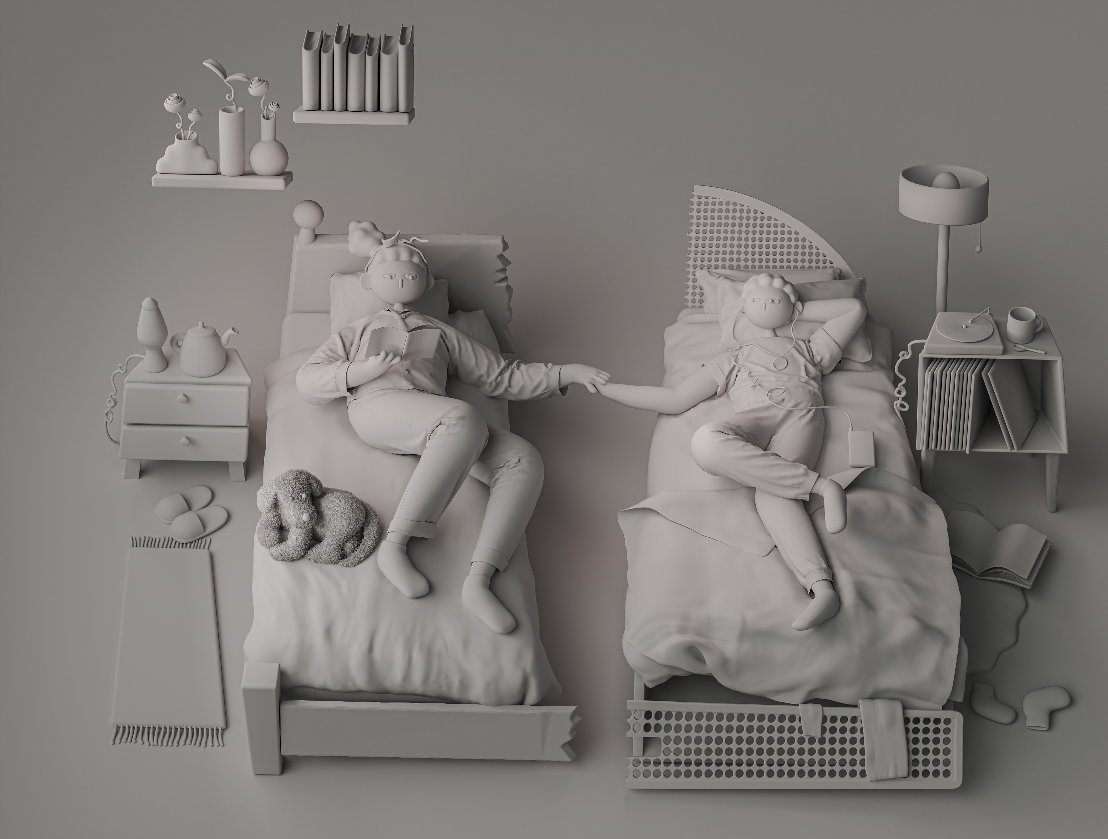
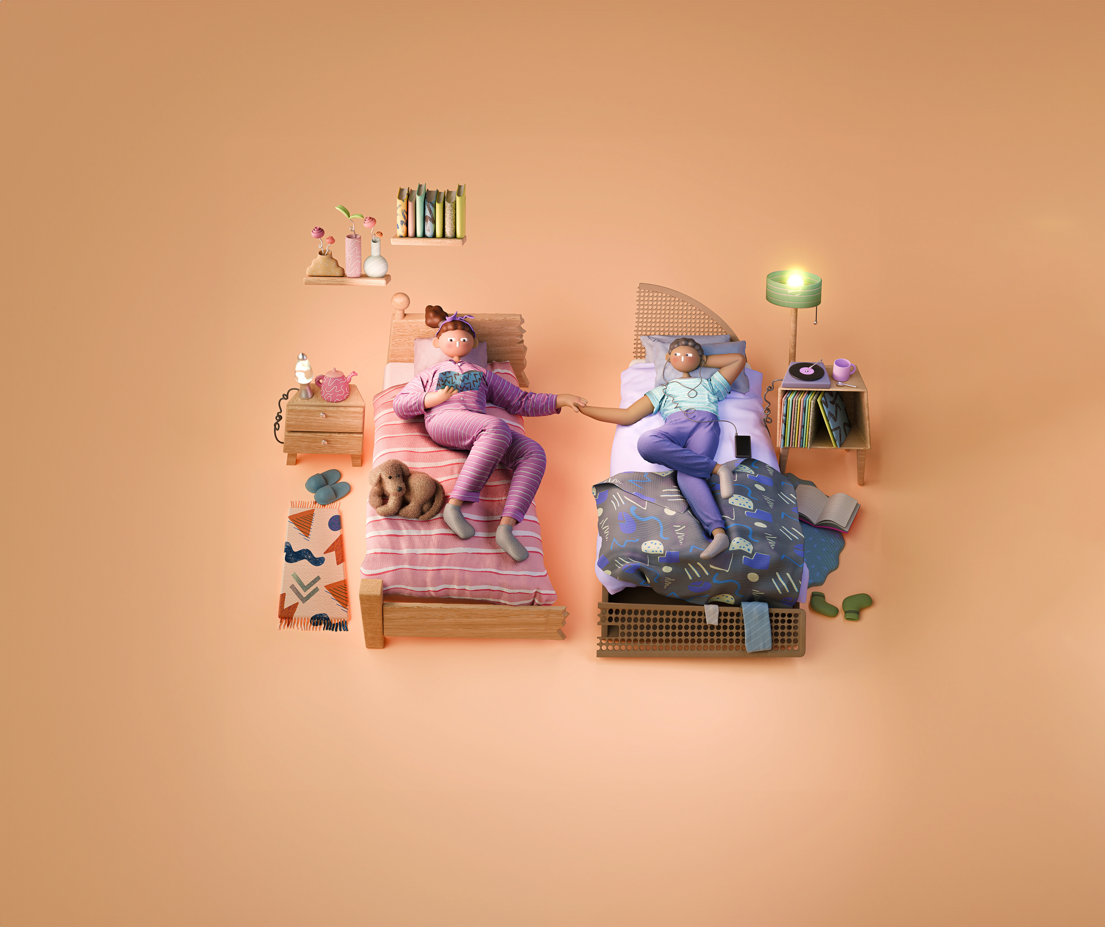
The broken perspective was created in a 2D sketch, making for a fun illustrative style. We wanted the two rooms to have equal importance so went for a birds eye angle, but played with the perspective within clear guidelines.
![](https://cdn.myportfolio.com/a6f341acd4671fd4083a18cd59ca5cd0/7b8f2efe-bc48-489f-bbf8-1506691a77b1_rw_1200.jpg?h=53dade85abce2b467a2f54eb4bcab09e)