Costa Coffee is a UK-based chain with over 3,800 stores worldwide and a mission to "to save the world from mediocre coffee”.
Cabeza Patata was invited to create a series of character-driven illustrations to celebrate Costa's 2021
Coffee Club launch. The posters should depict a variety of characters playfully interacting with Costa's iconic coffee cups and products.
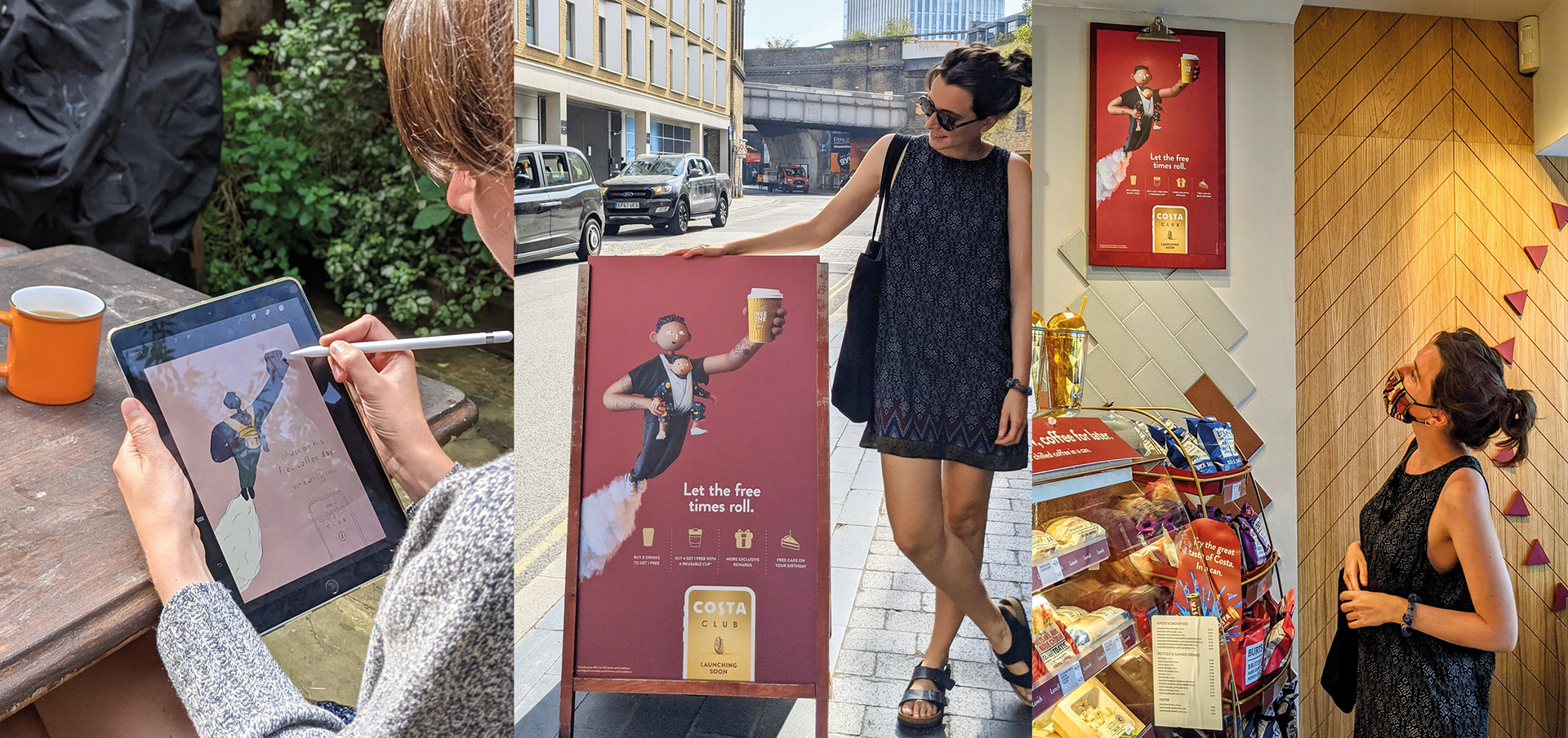
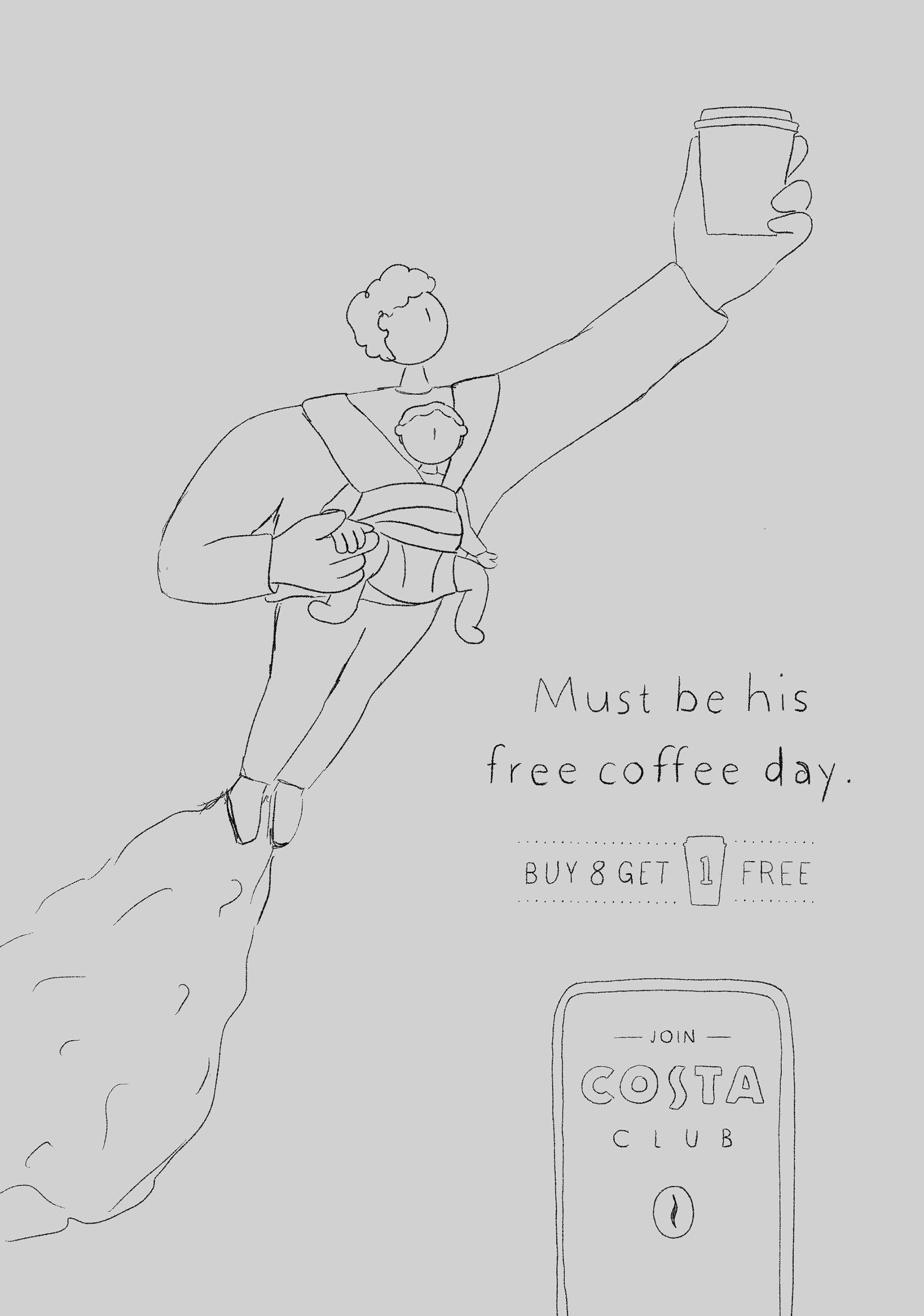
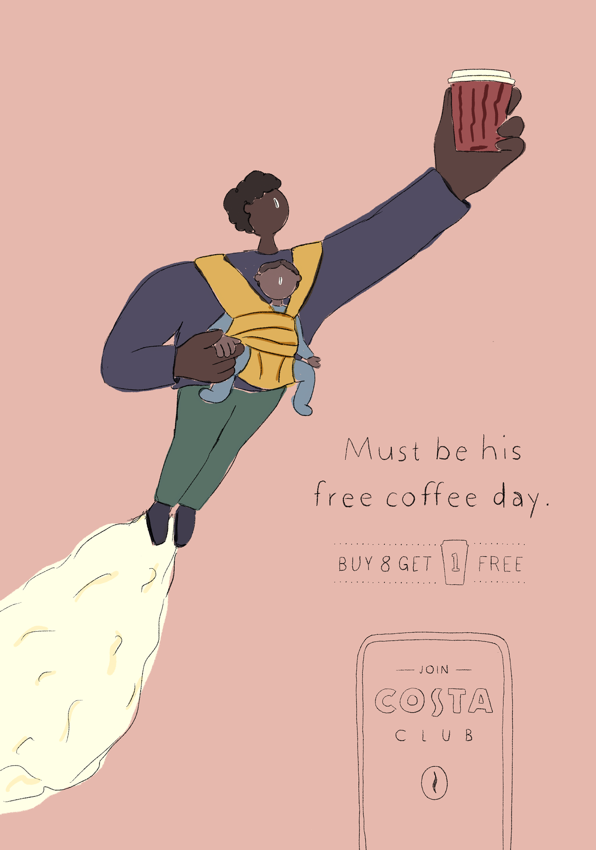
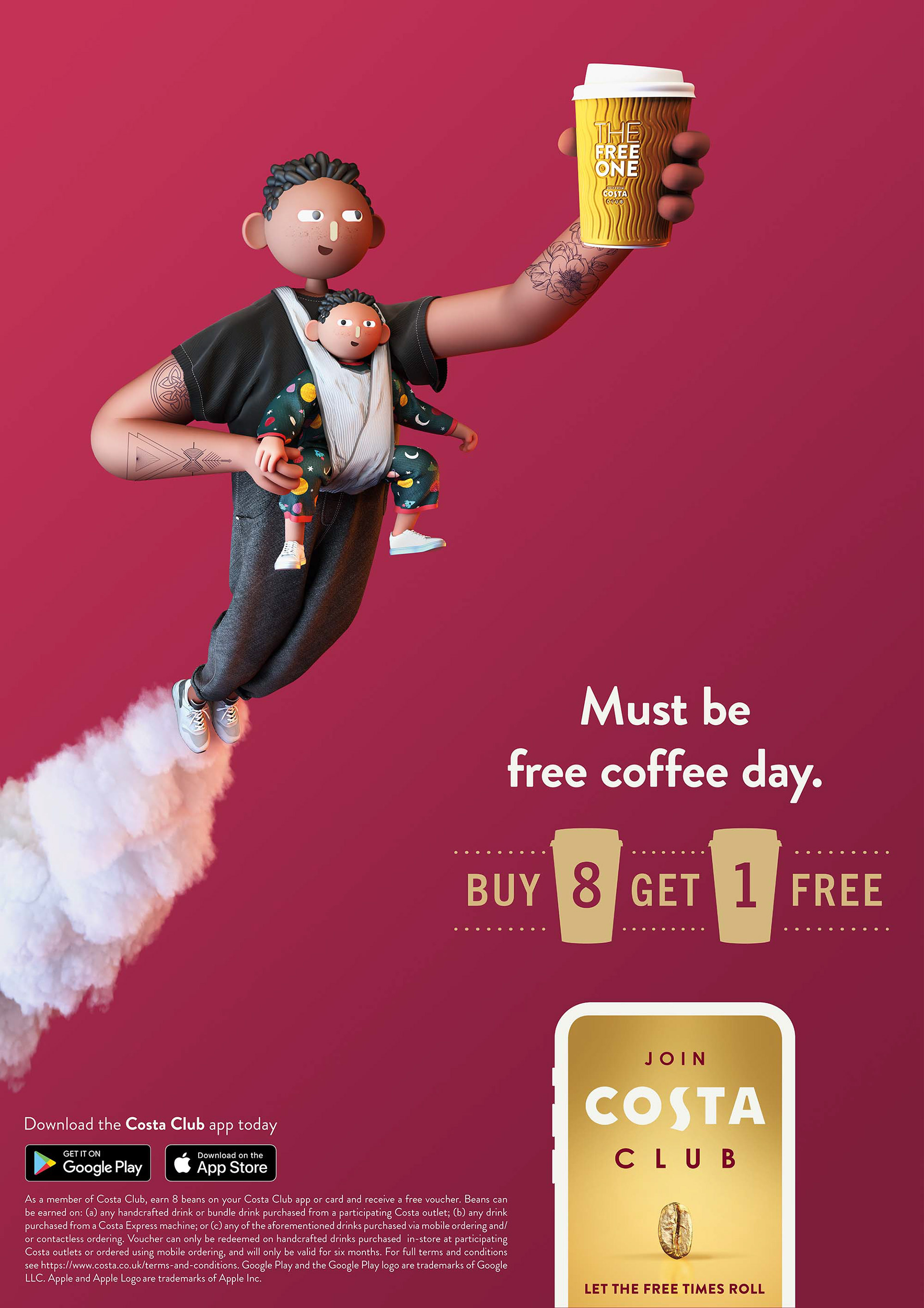
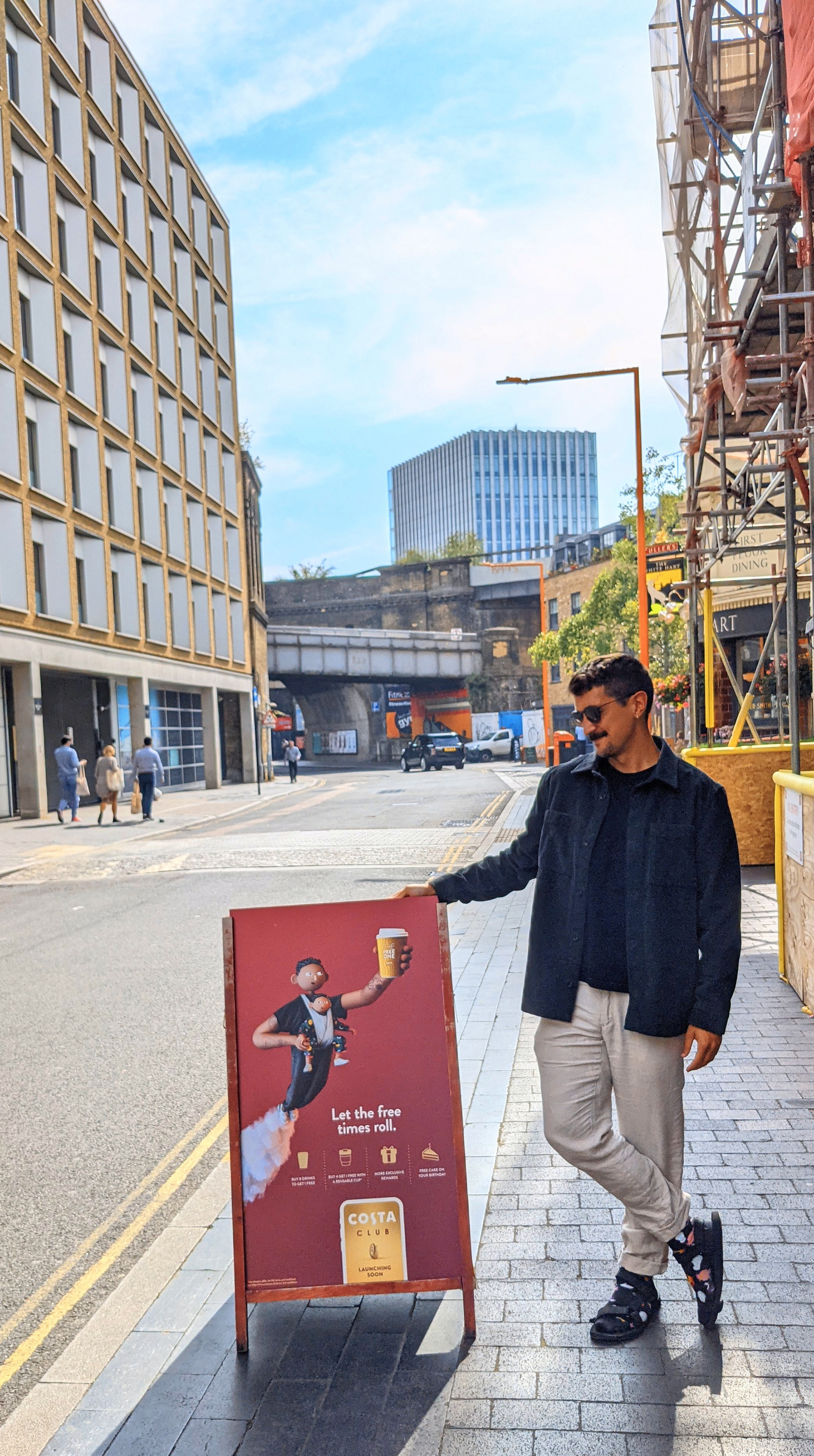
The first in the series shows a father with his baby skyrocketing into the air, coffee cup outstretched. The perspective is exaggerated to feel like a classic superhero poster with a playful twist. The baby is wearing a babygrow with a night sky pattern and has a matching hairdo to Dad.
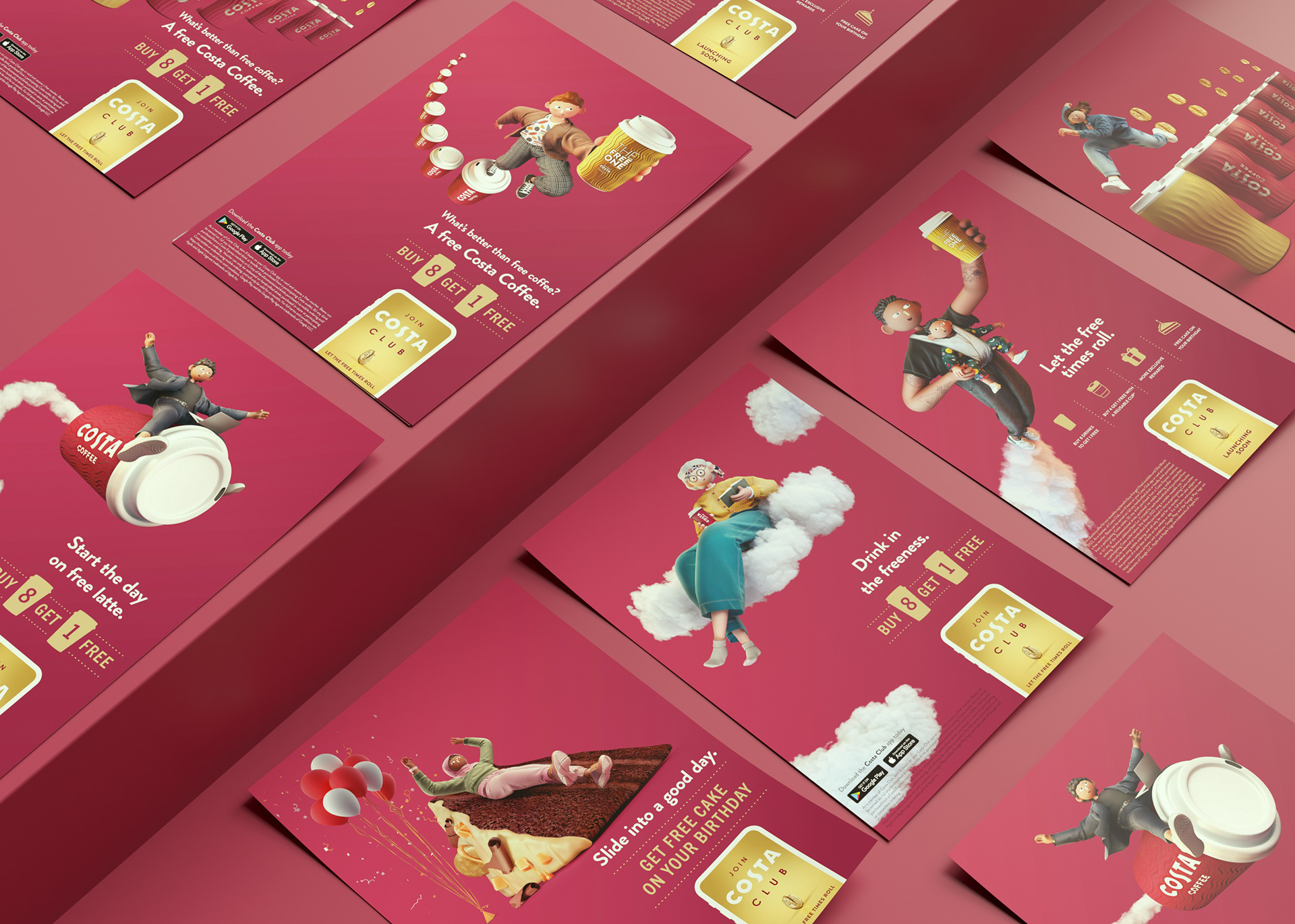
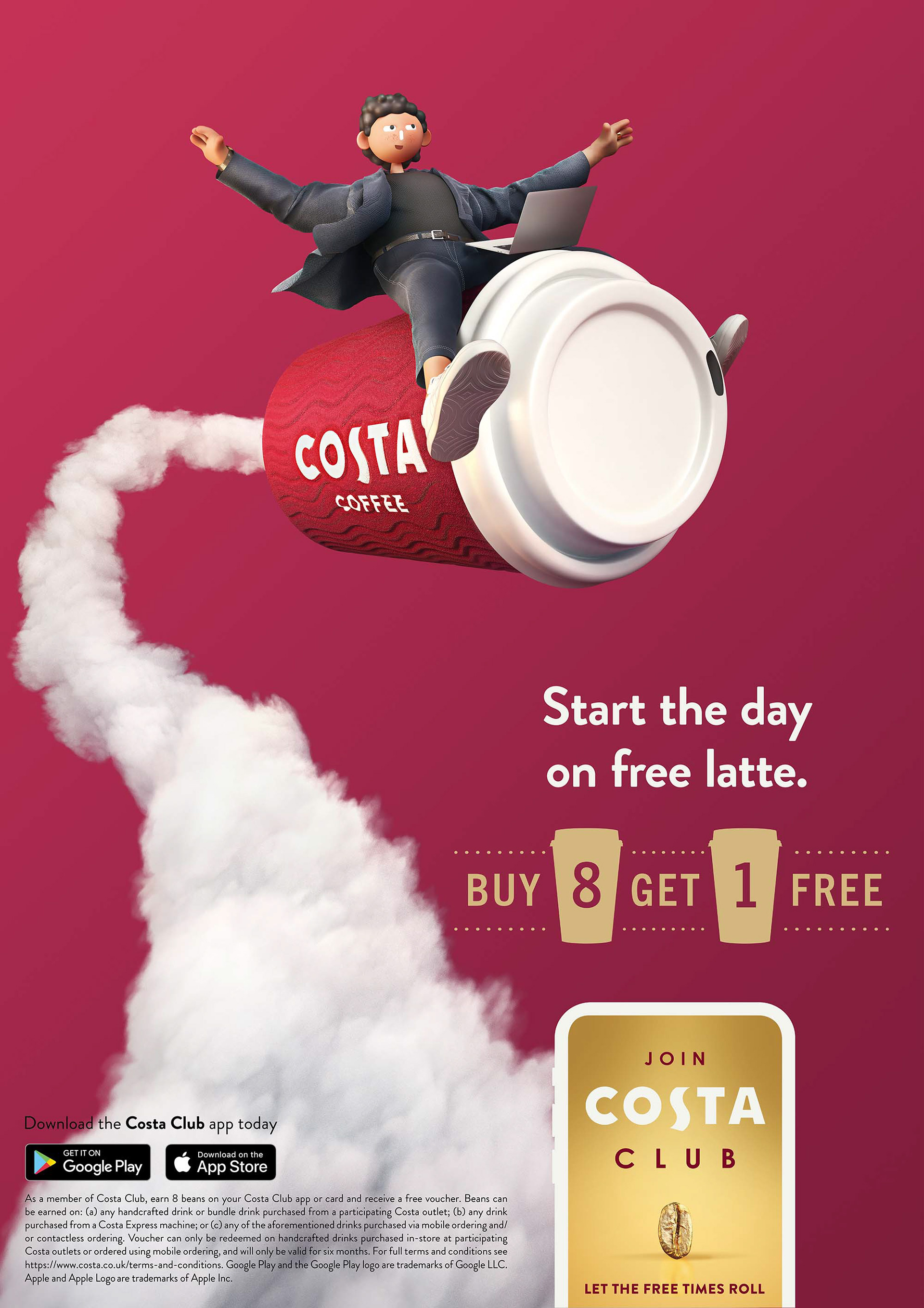
This character is a modern businessman joyously riding atop a takeaway coffee cup. The dynamism comes from the movement in the puff of smoke swirling around the poster and the flow of his jacket as he balances.
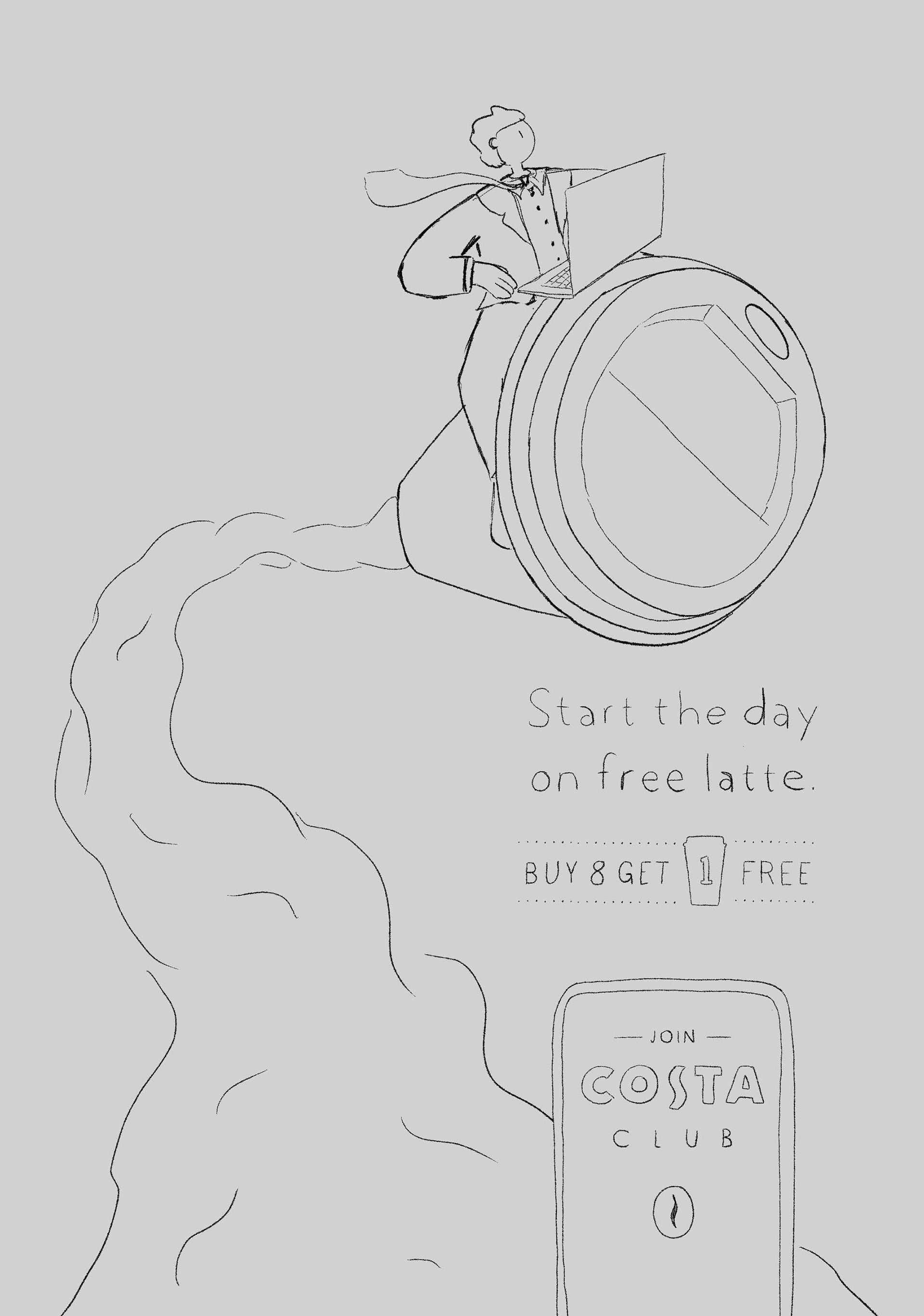
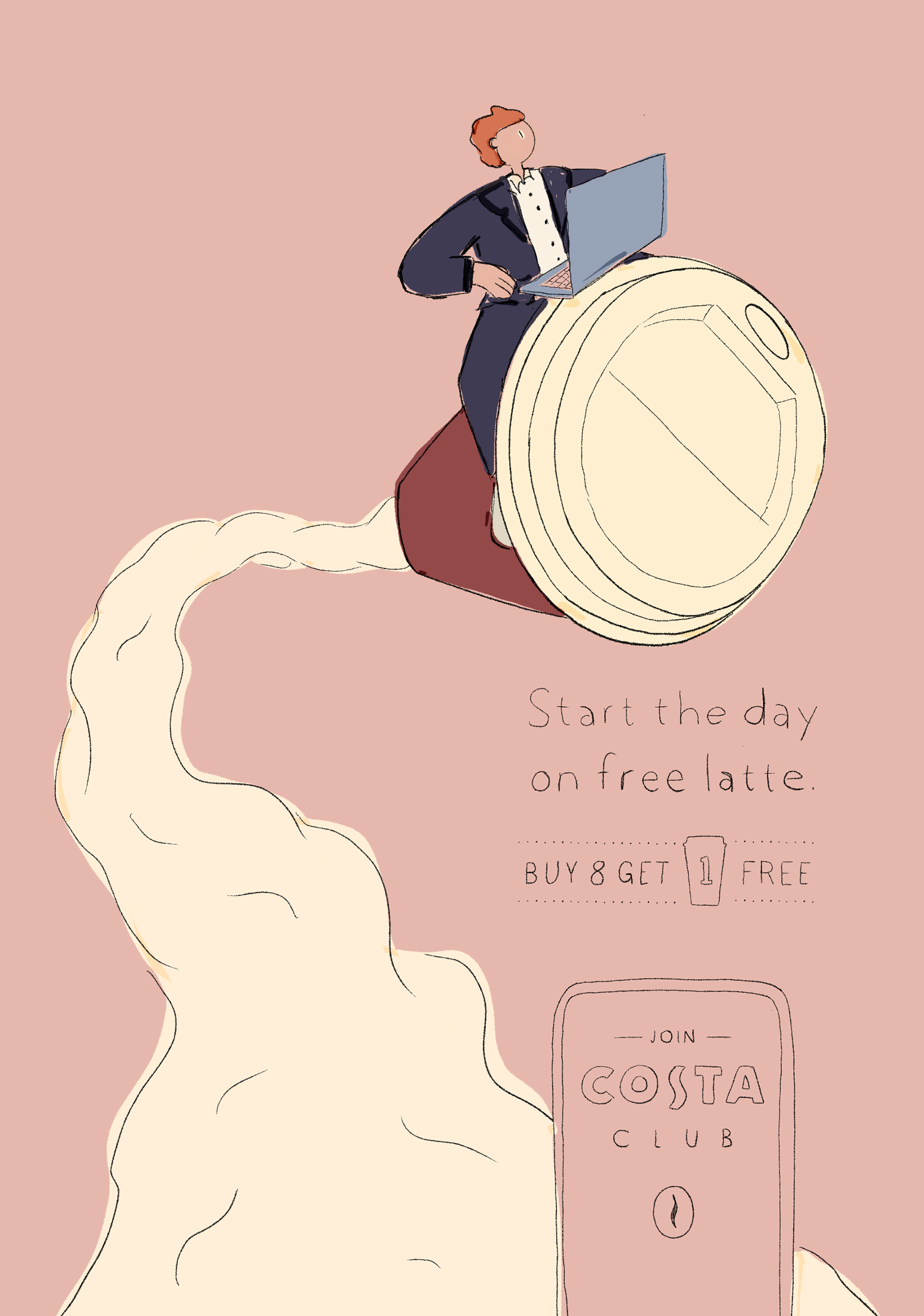

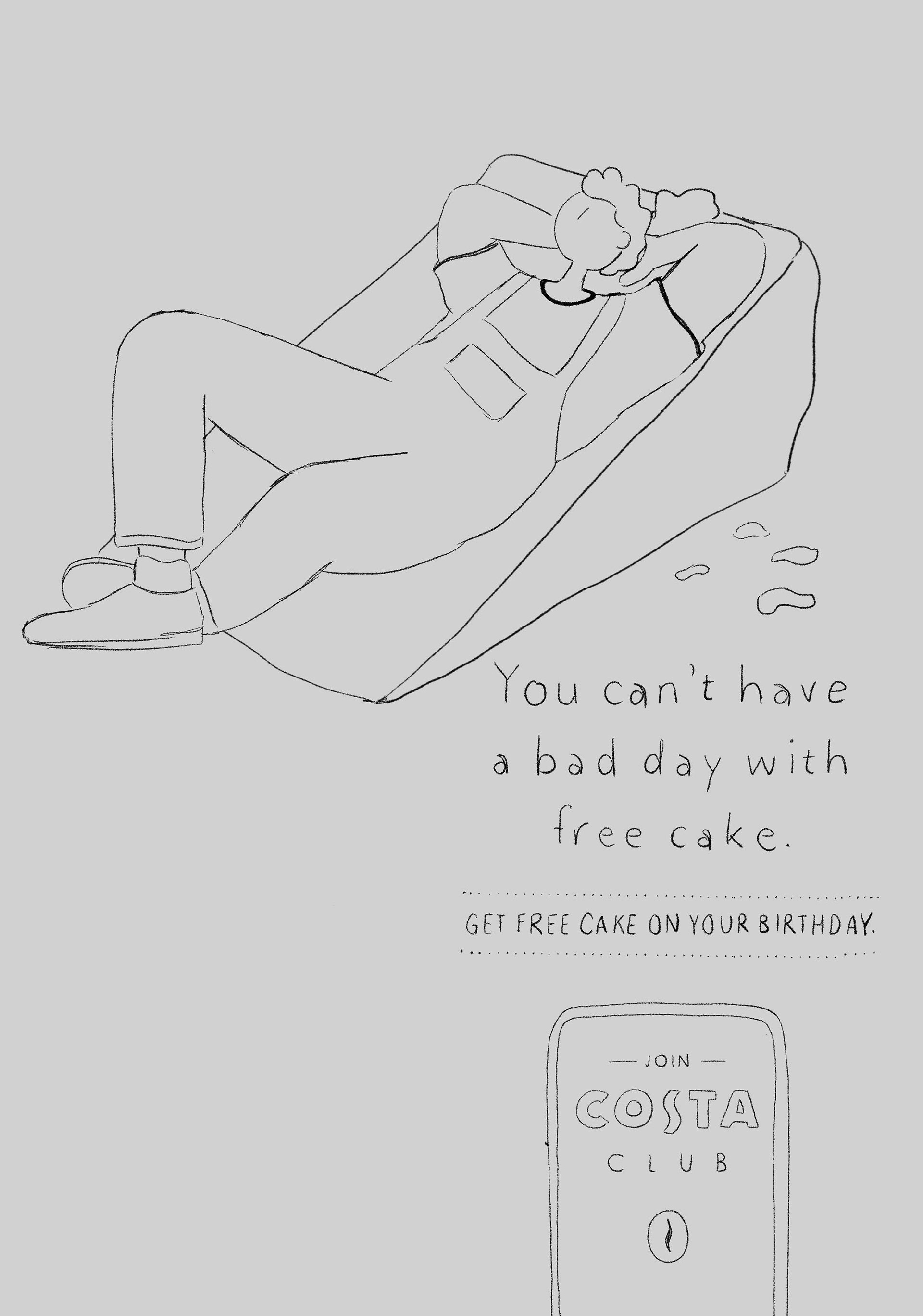
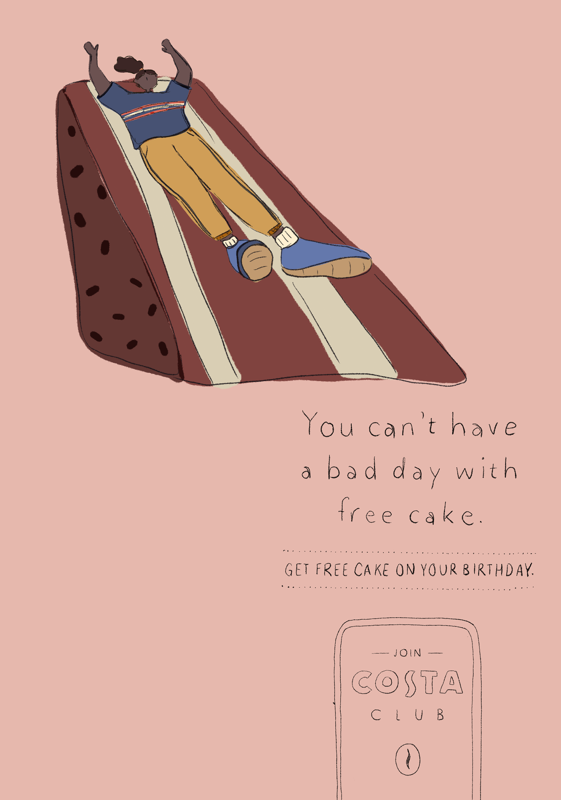
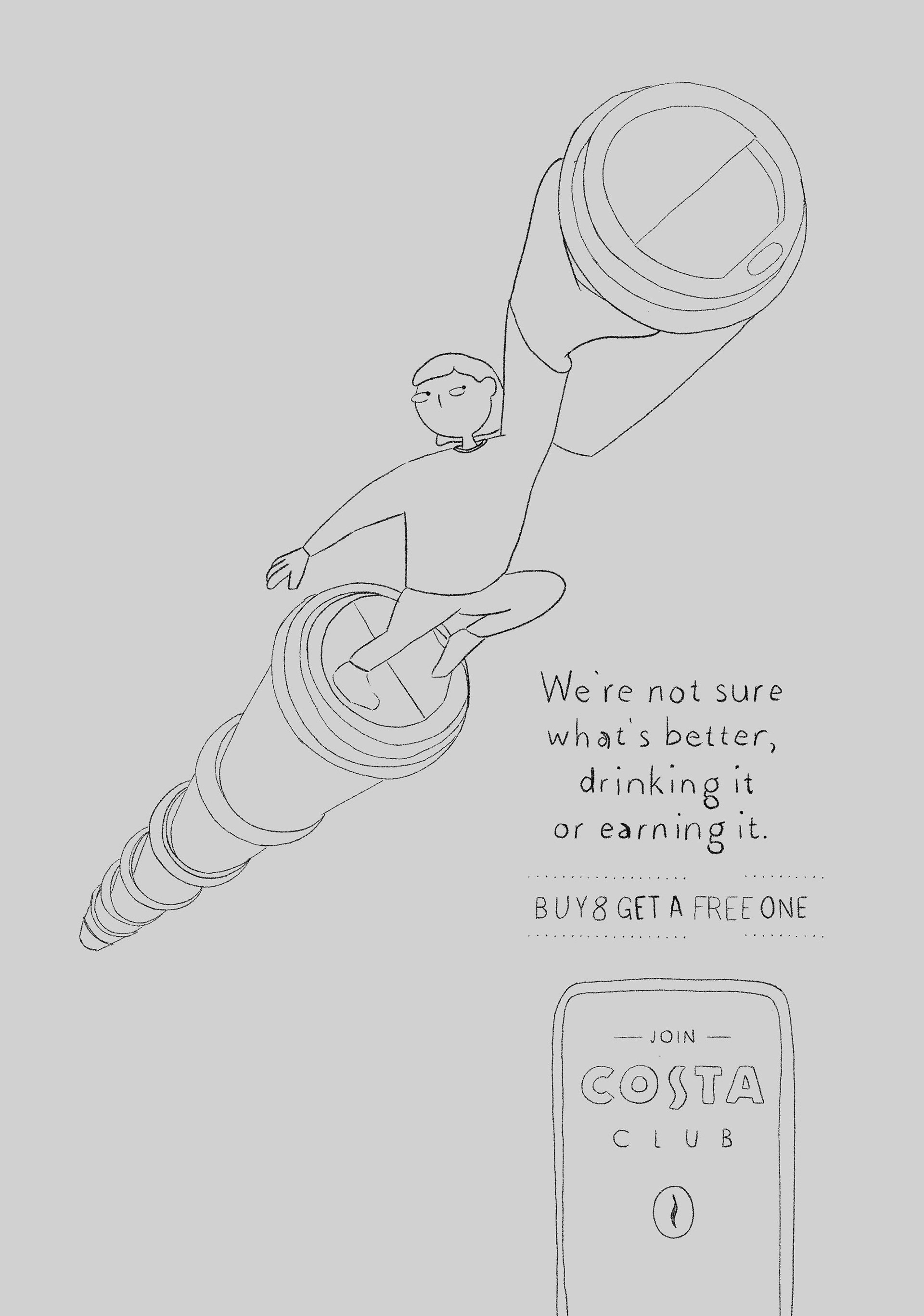
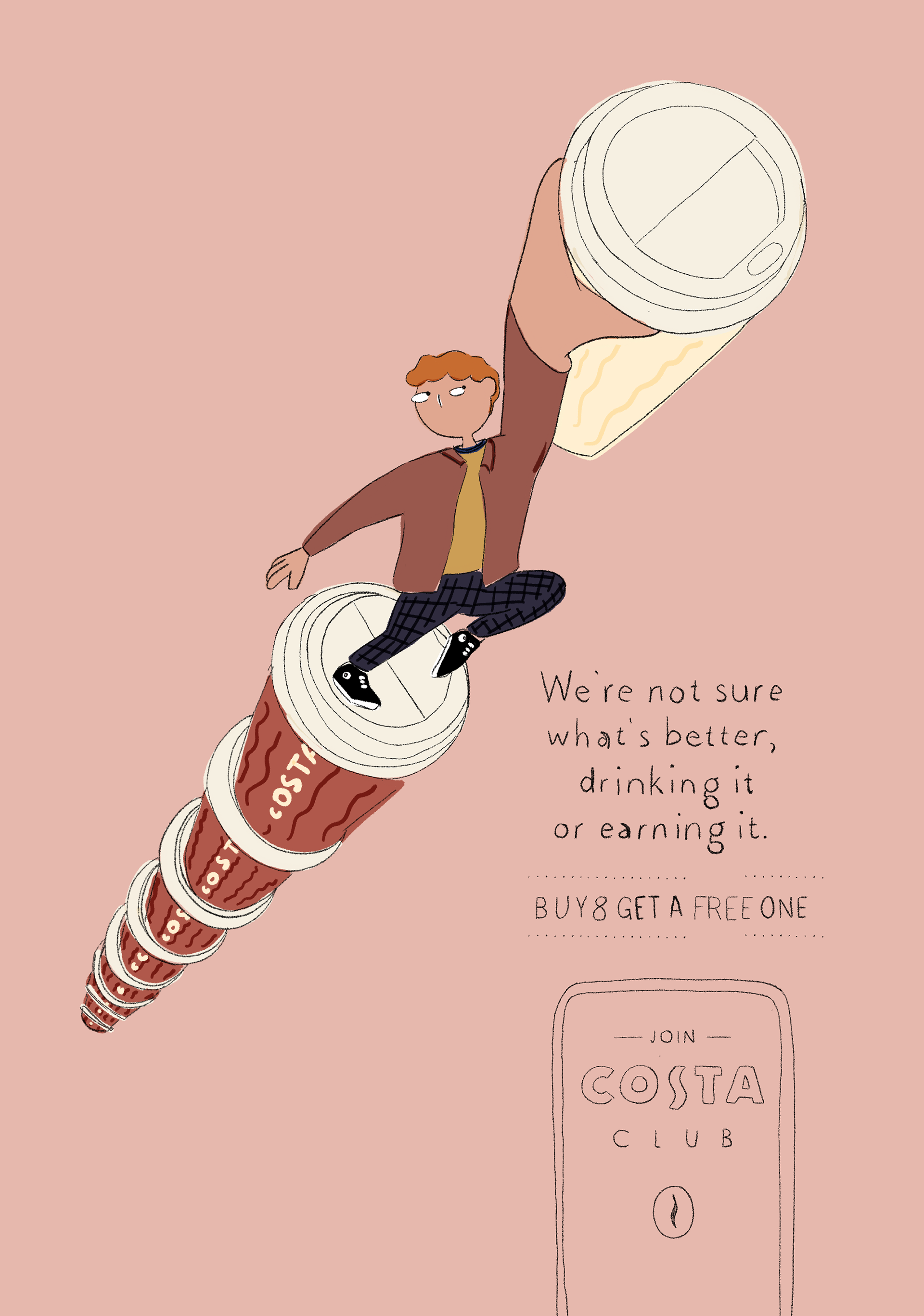
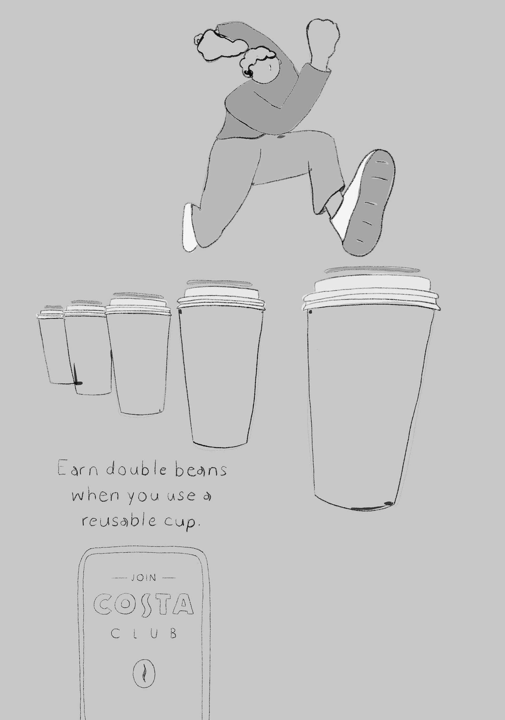
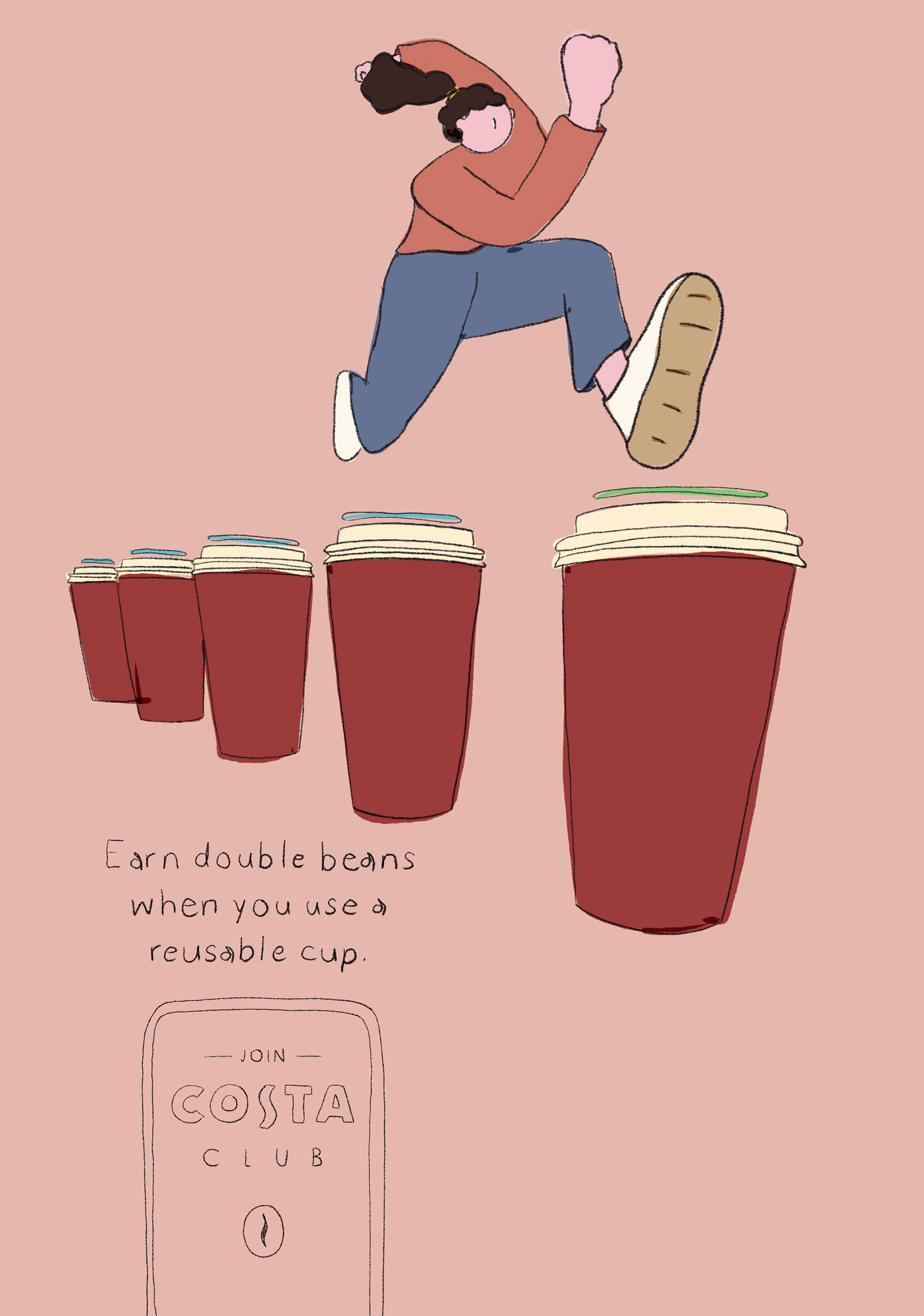
Each poster was designed initially as a 2D sketch to confirm the composition and sizes of elements. Later some adjustments in pushing perspectives even further and adding details in the handmade clothing, accessories and characters' expressions helped bring the posters to life and give personality to the characters.
Here we represent the feeling of total calm in which, book in one hand with a cup of coffee in the other, you almost feel you're floating on a cloud. Our character is cosy with different textures in her clothing: woollen socks, velvet trousers and a knitted cardigan.
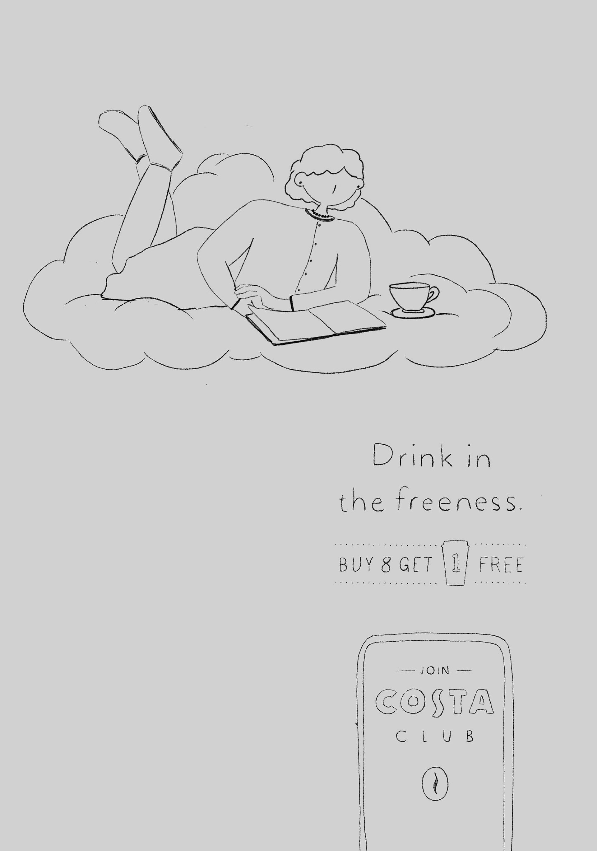
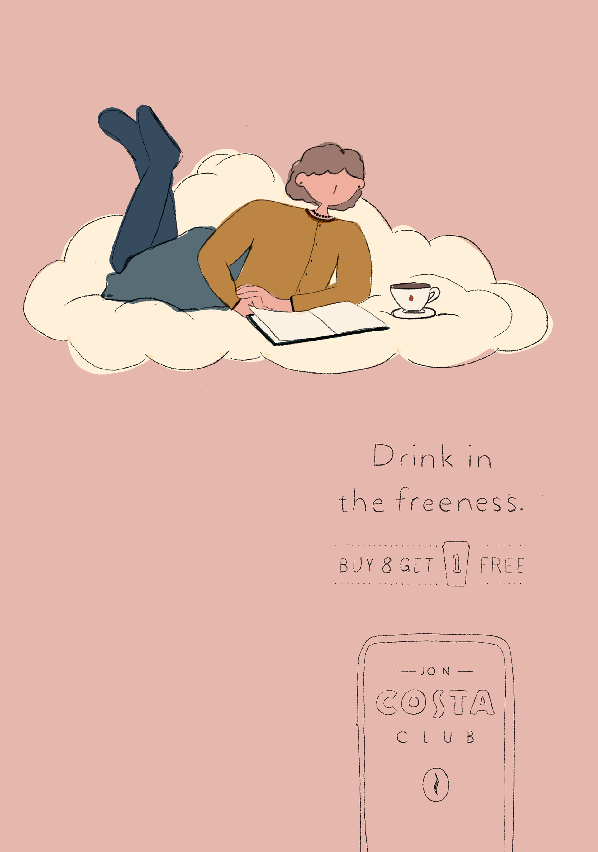
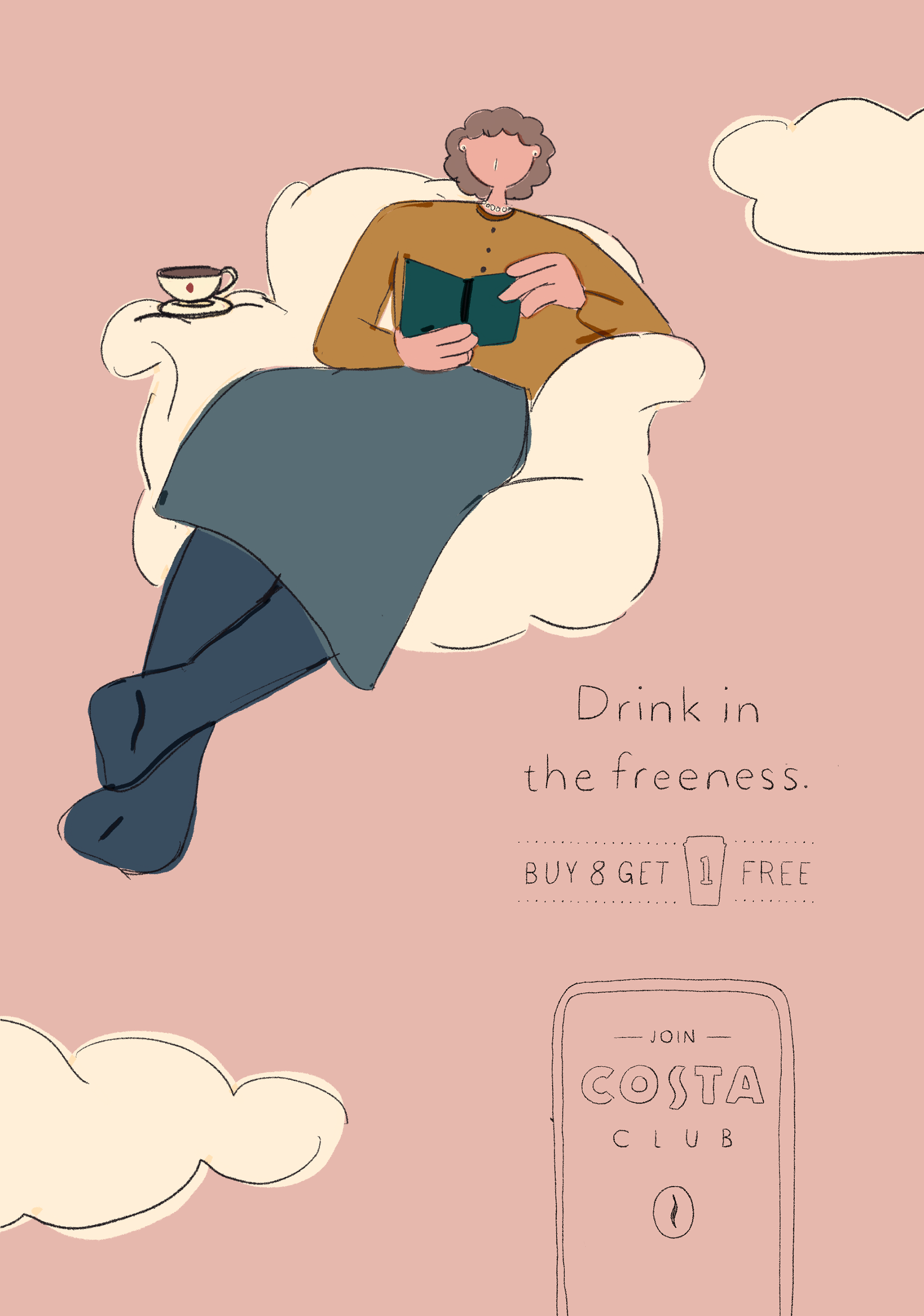
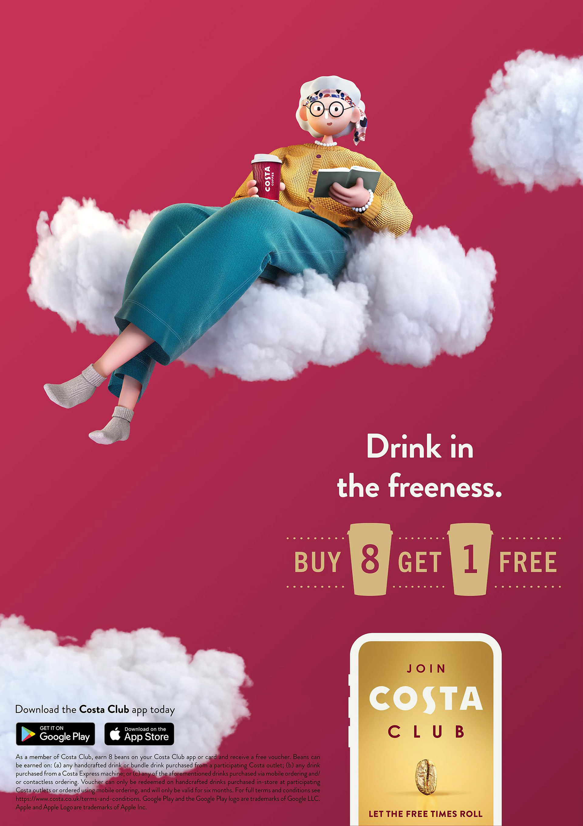
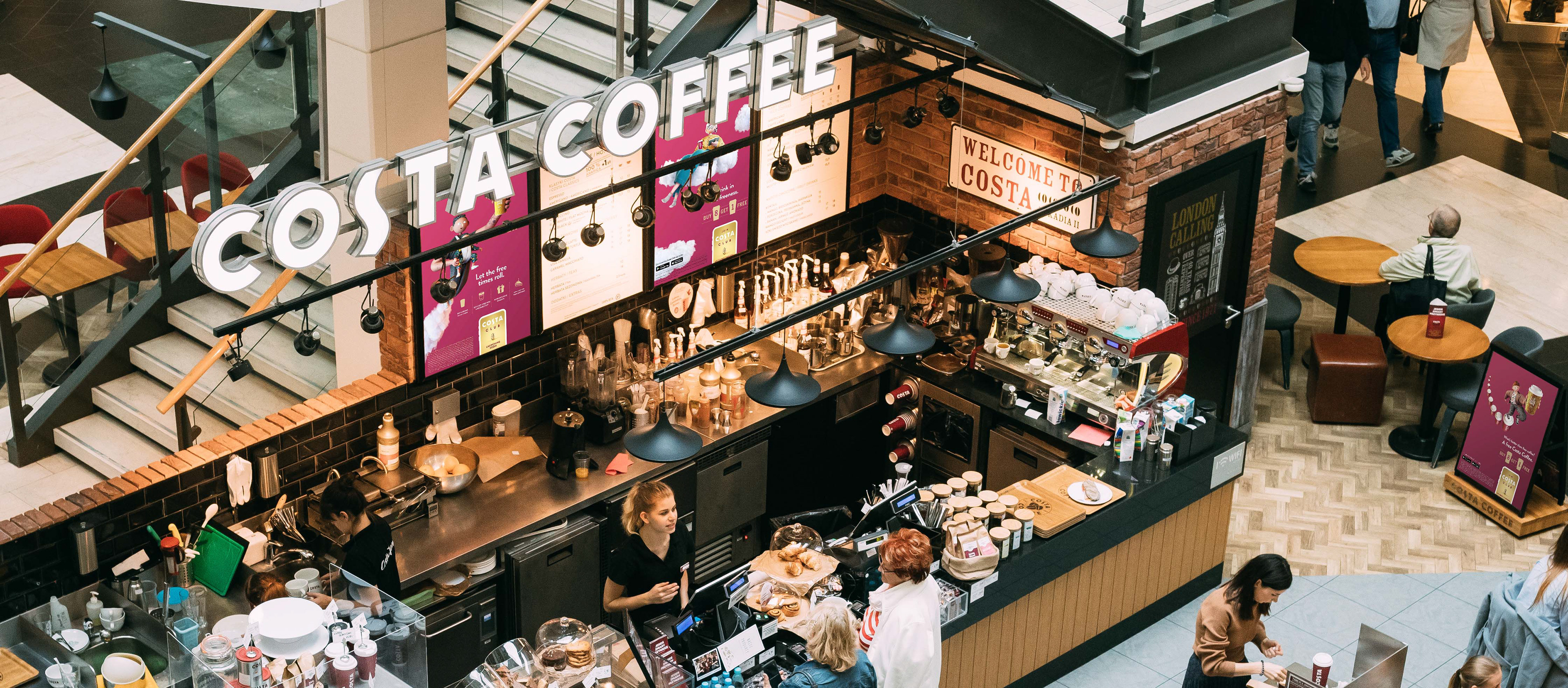
This campaign is appearing across the country so we wanted to represent Costa Coffee's varied customer base. The aim is for people to identify with the characters and enjoy the fun and unlikely situations.
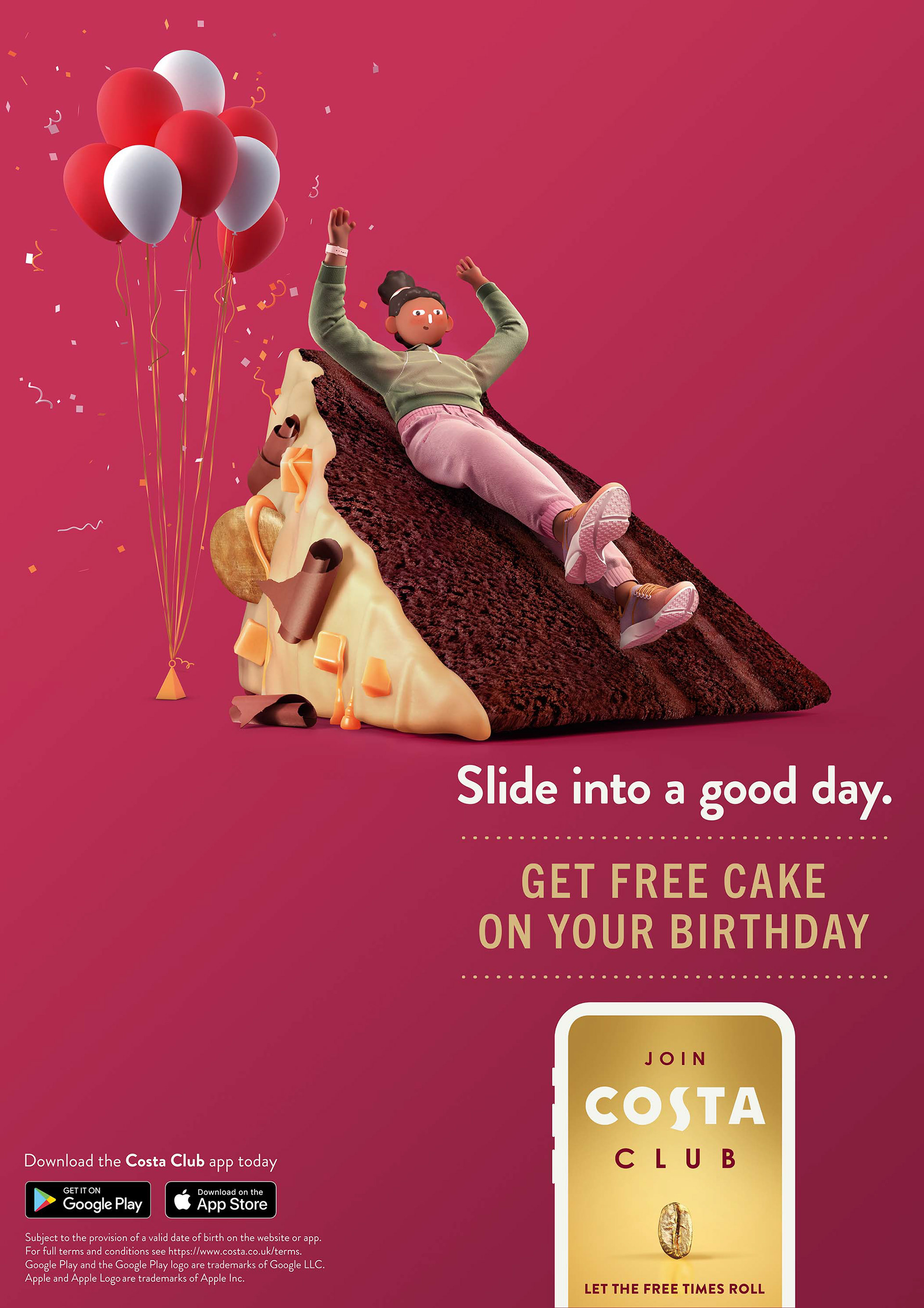
This poster had the added challenge of recreating a realistic, existing, and very popular Costa cake. We wanted to reach a middle ground between realism and graphicality to enjoy the absurd humour of our young, sporty character sliding down a cake gleefully.


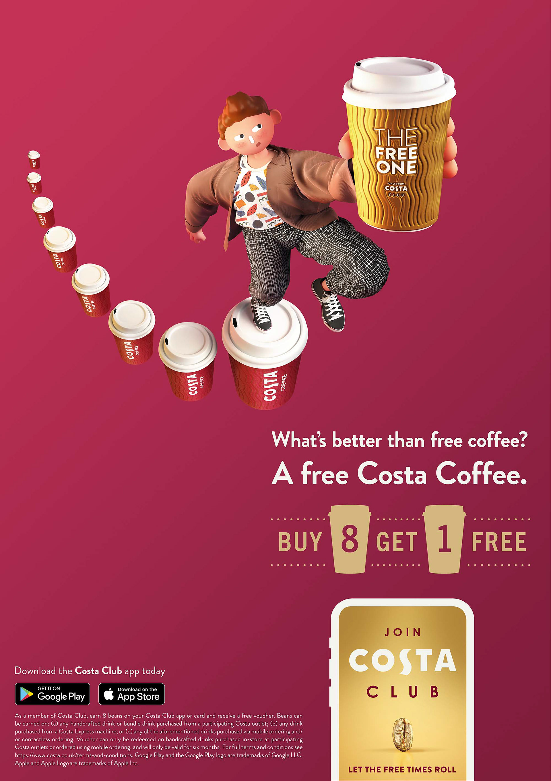
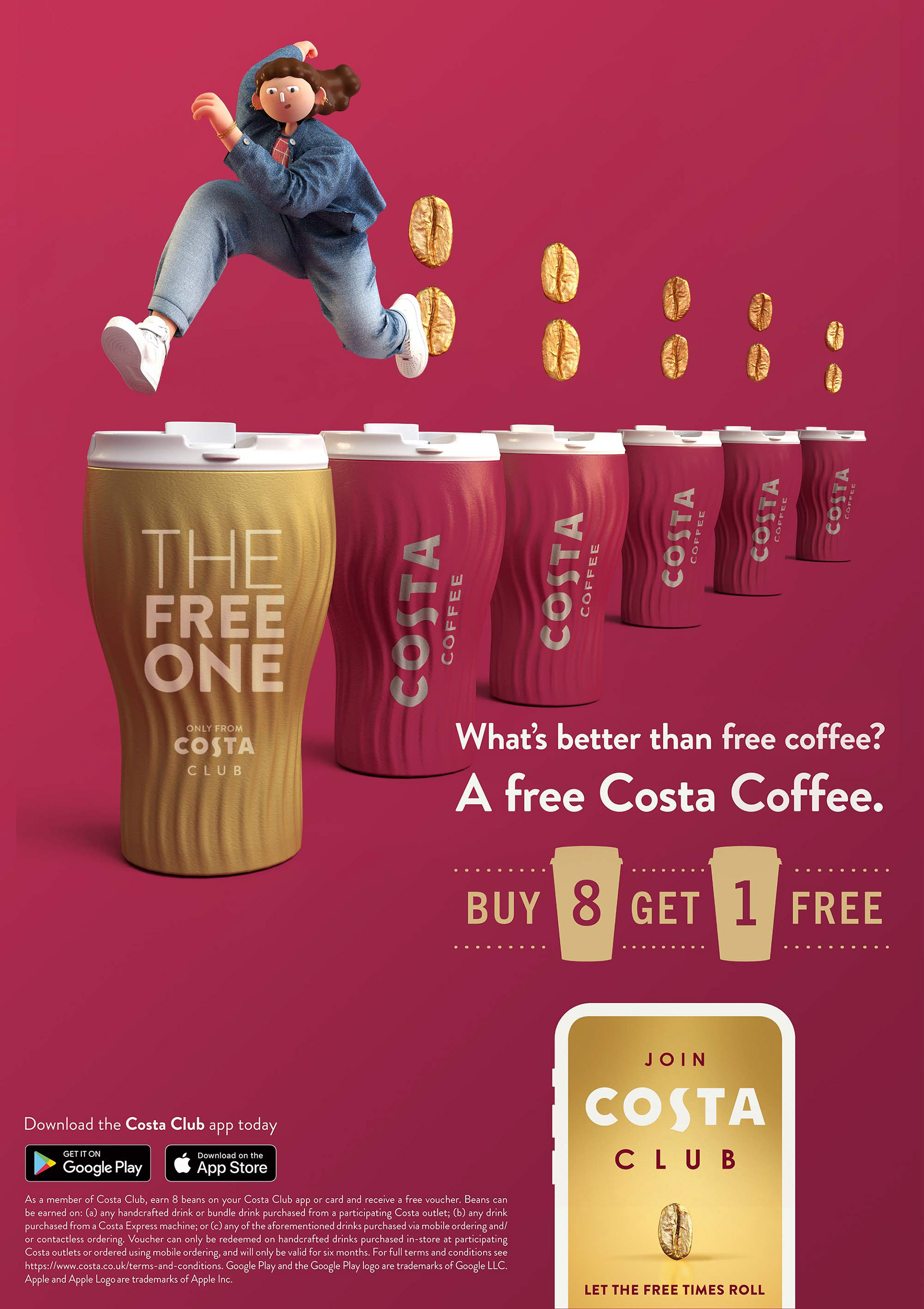
To imagine the concept of 'buy 8 get 1 free' visually we have a character stepping up the Costa cup staircase to reach their 'Free One'. The shimmer of gold and exaggerated perspective make this the focal point of the image and add some drama to the composition.
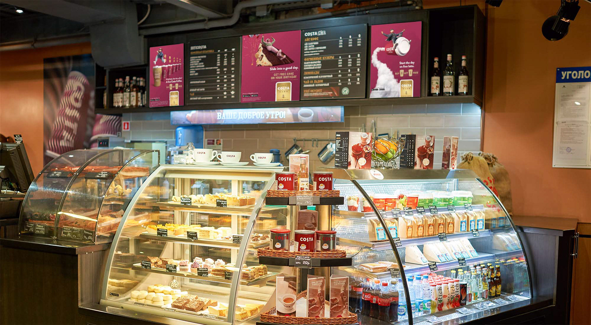
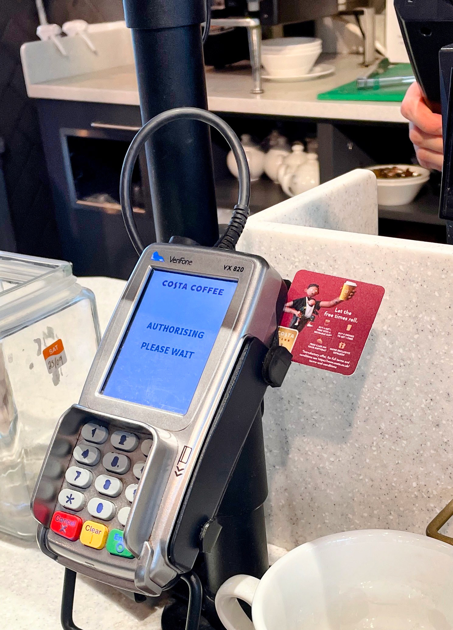
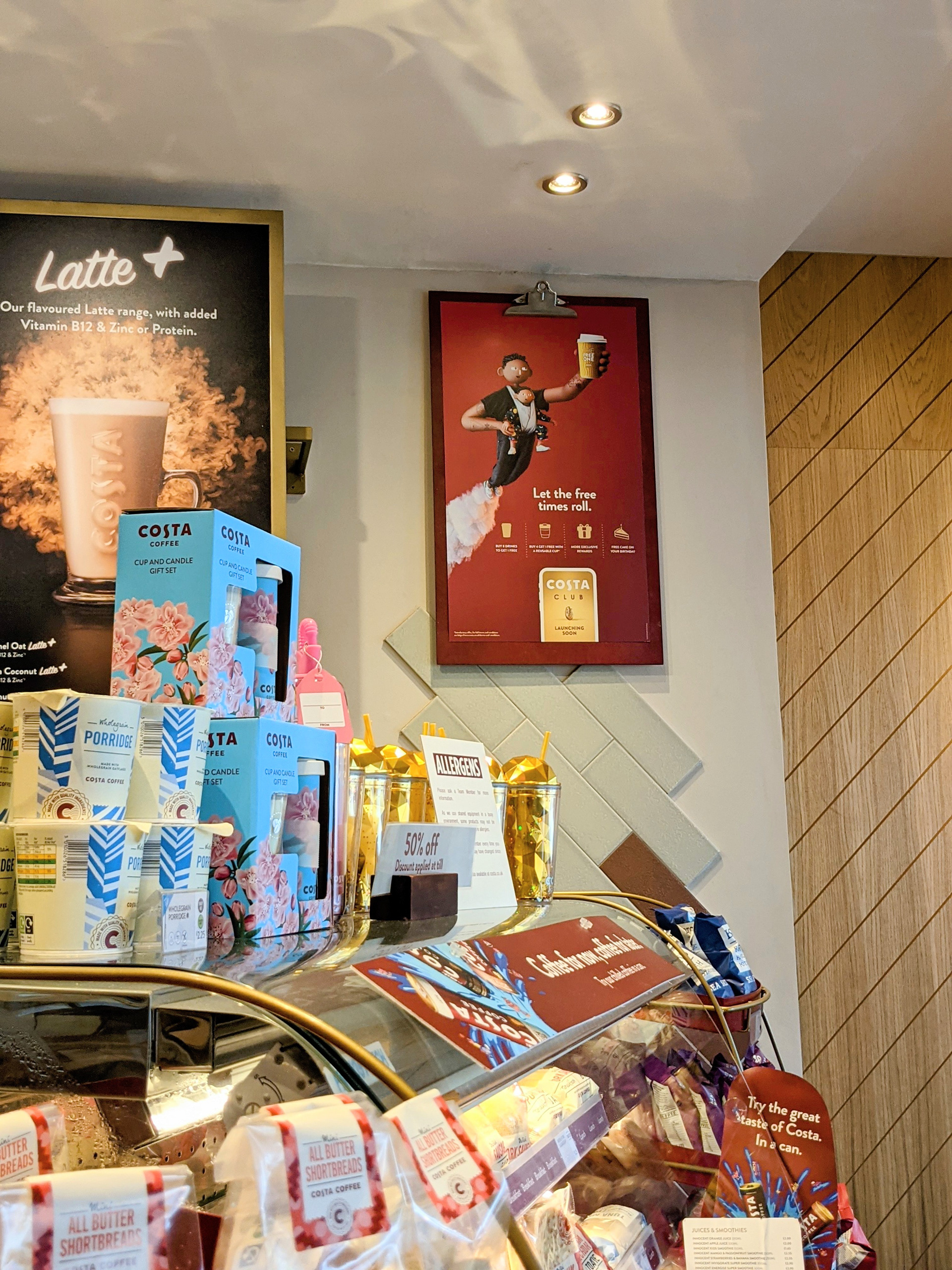
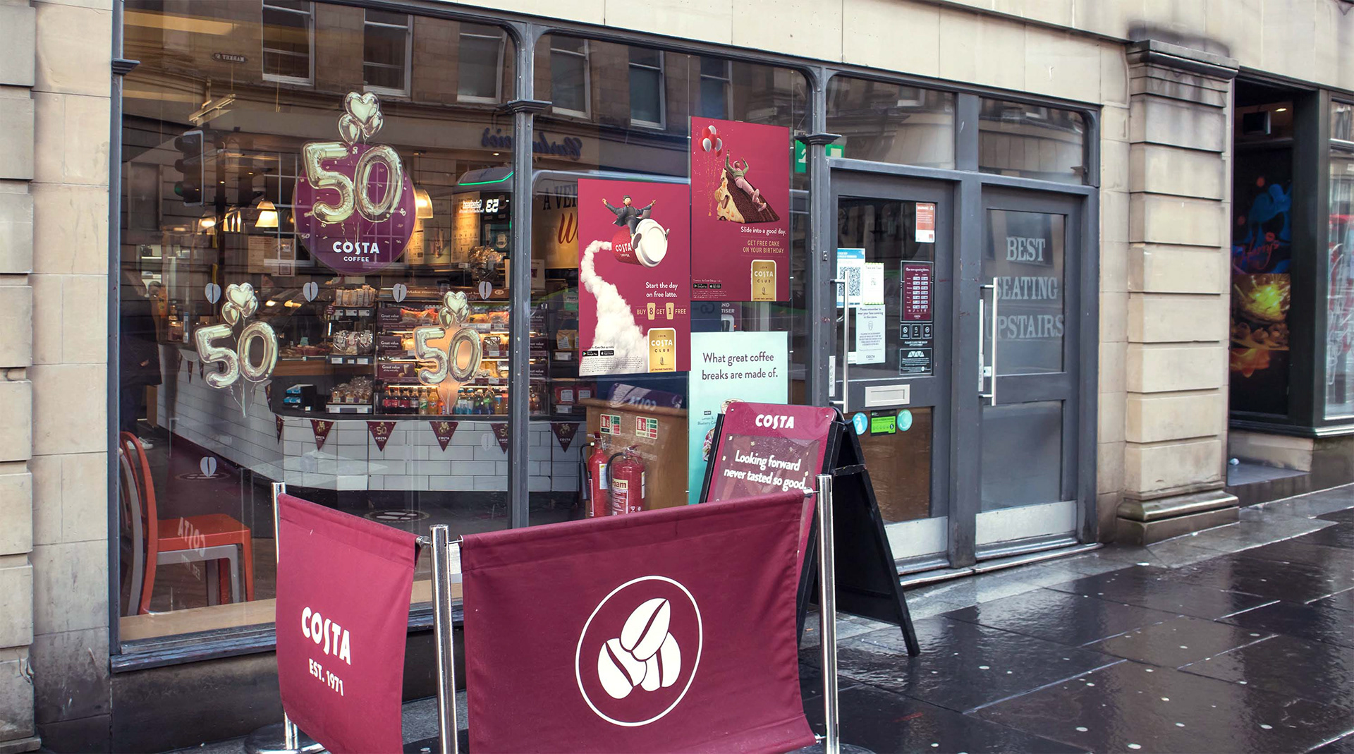
As the campaign rolls out across thousands of stores, the posters will appear in different locations and formats, sometimes popping up unexpectedly.
We wanted a dynamic, speedy position for this final poster, our character racing to reach her free coffee. The idea here was to feel like a video game, with golden beans collected as the character hops over the cups.
We have enjoyed the process of creating this campaign, from sketching out the initial ideas to seeing the posters come to life across different stores. It is a clear show of the power of characters and the reach of illustration.
