

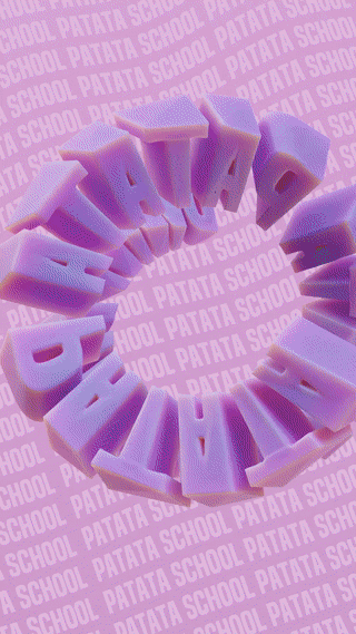
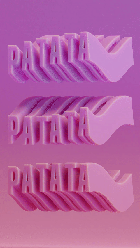
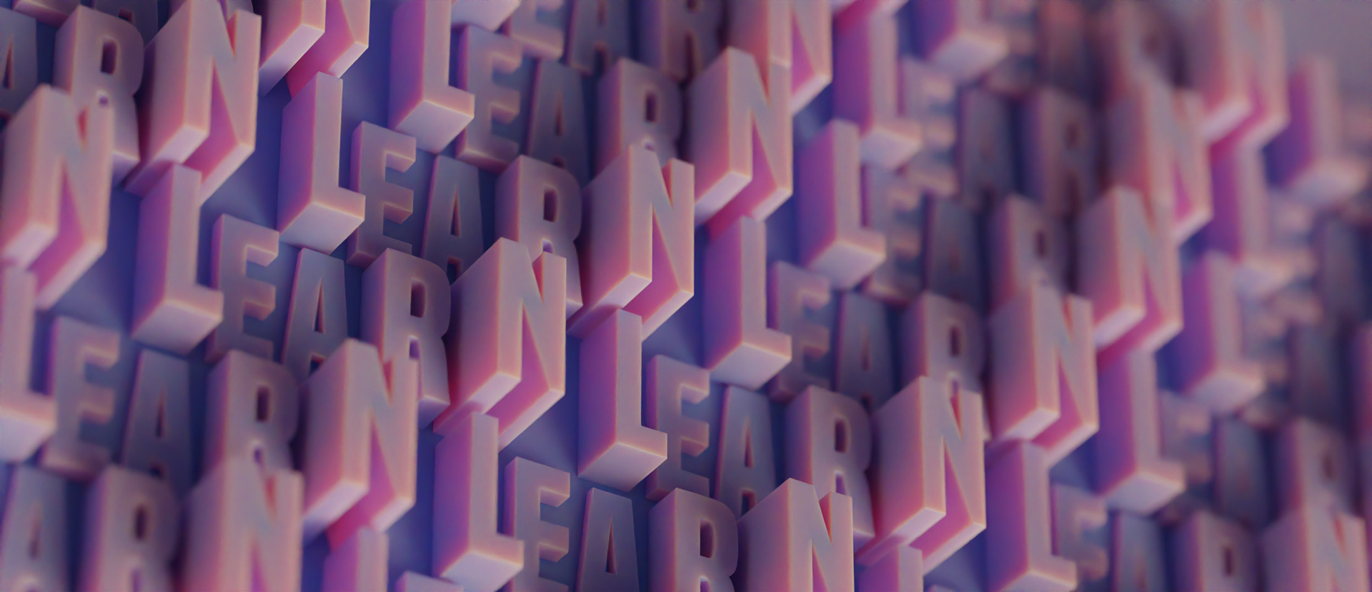
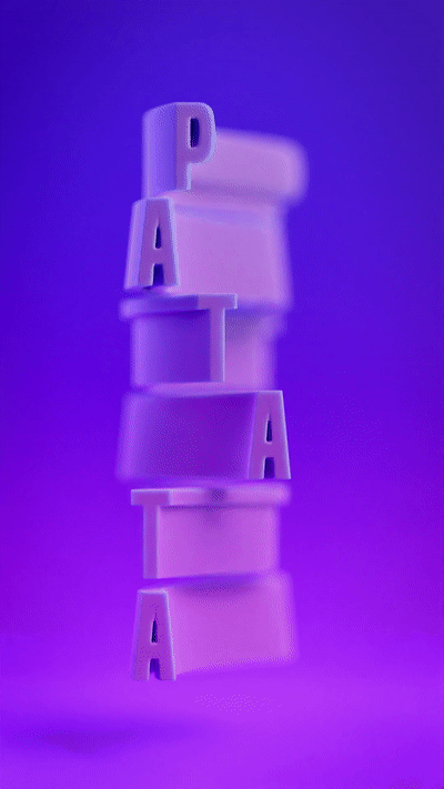
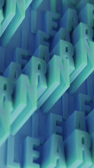
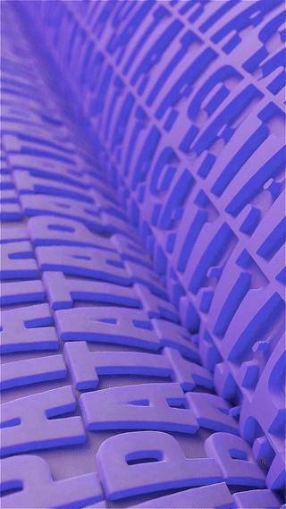
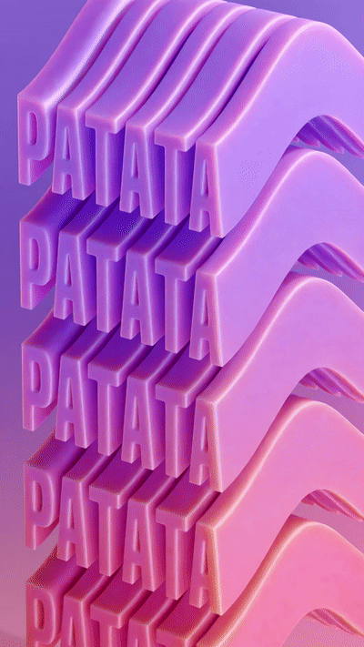
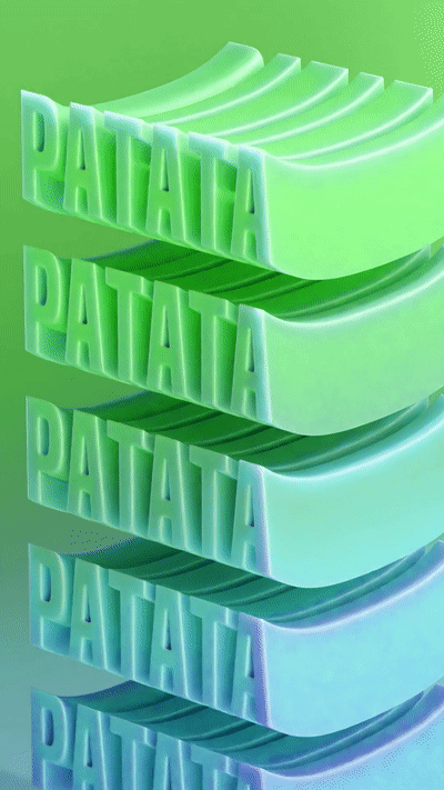
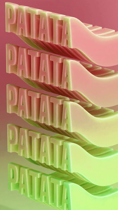
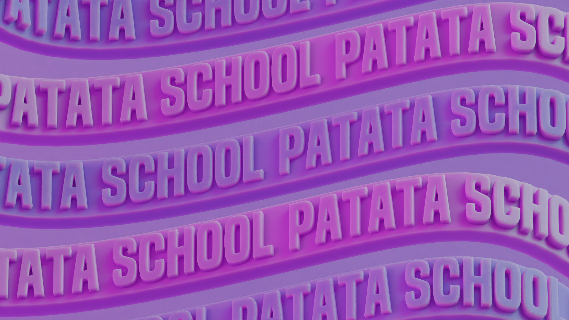
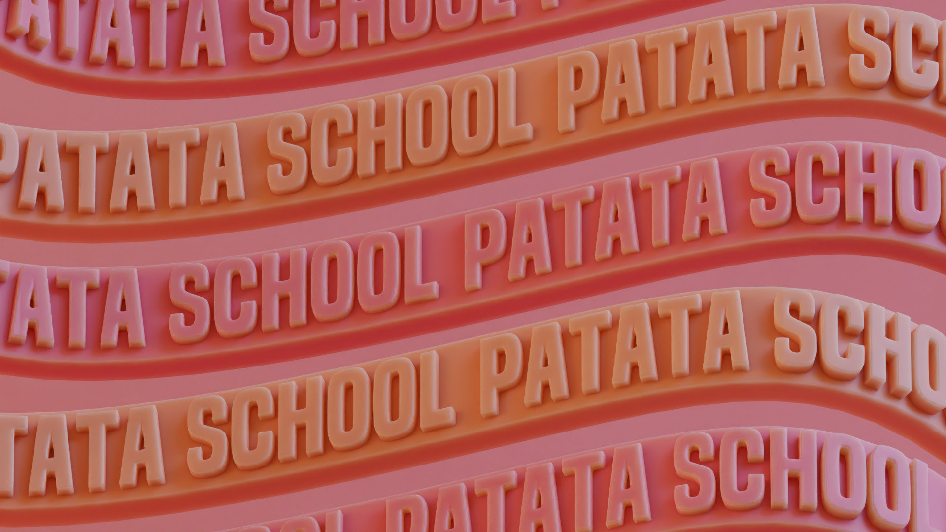
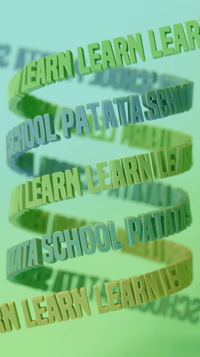
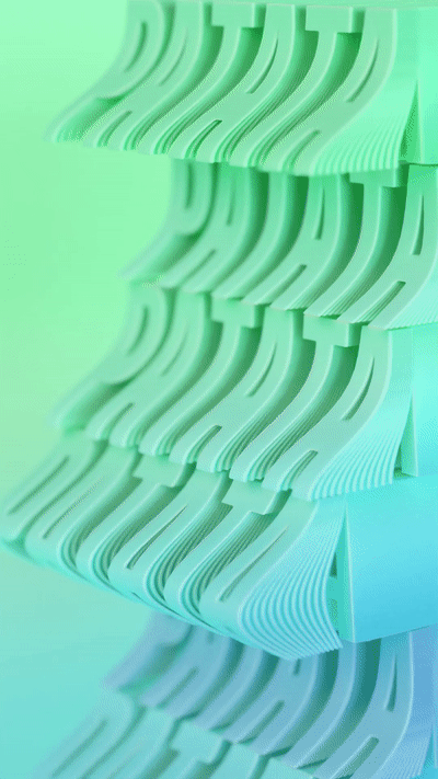
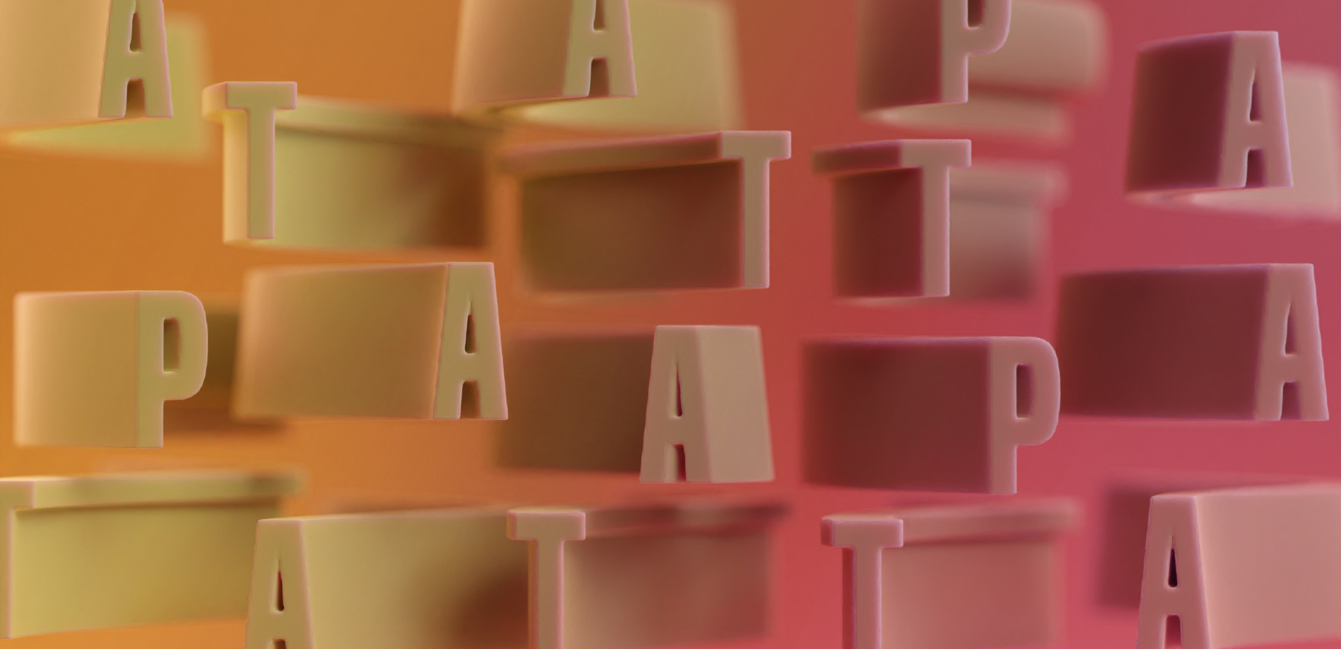
Typomotion is an exploration in typography, mixing classic graphic type design with an illustrative flair. These two worlds complement each other with a balance between legibility and clarity of message, and visual interest.
While the pieces appear modern with contemporarily popular colours and visual effects, there is something reminiscent of a traditional printing press that we play with throughout the series.
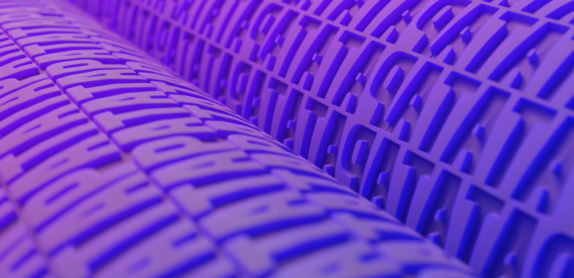
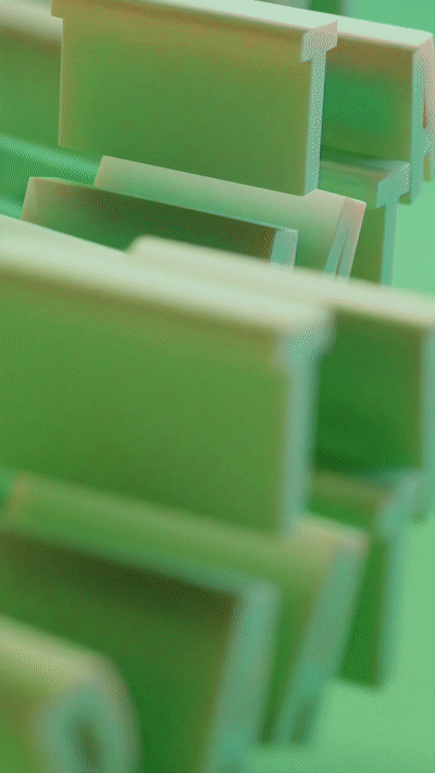
Typomotion is bold and colourful yet always careful to work within clear boundaries of Graphic Design. Although the series is full of different animation effects, vibrant colours and even gradients, we are always cautious to be consistent with the font, the materials and textures, and the type and amount of movement in each piece.
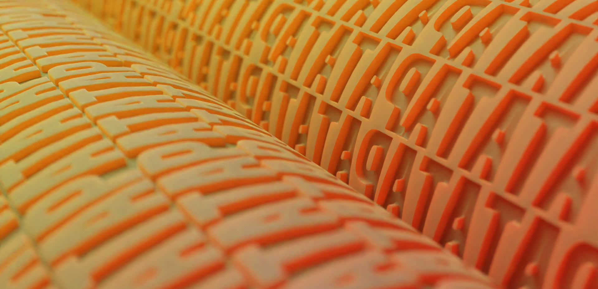


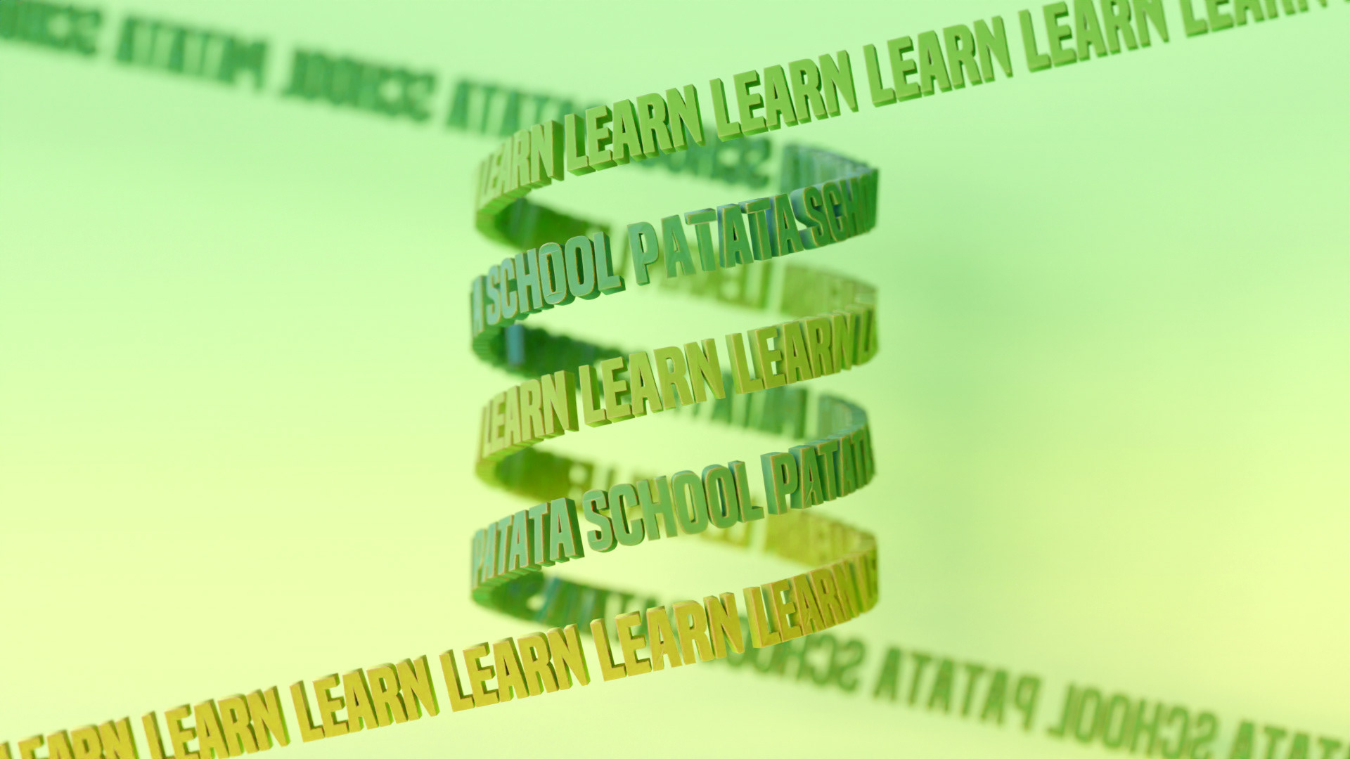
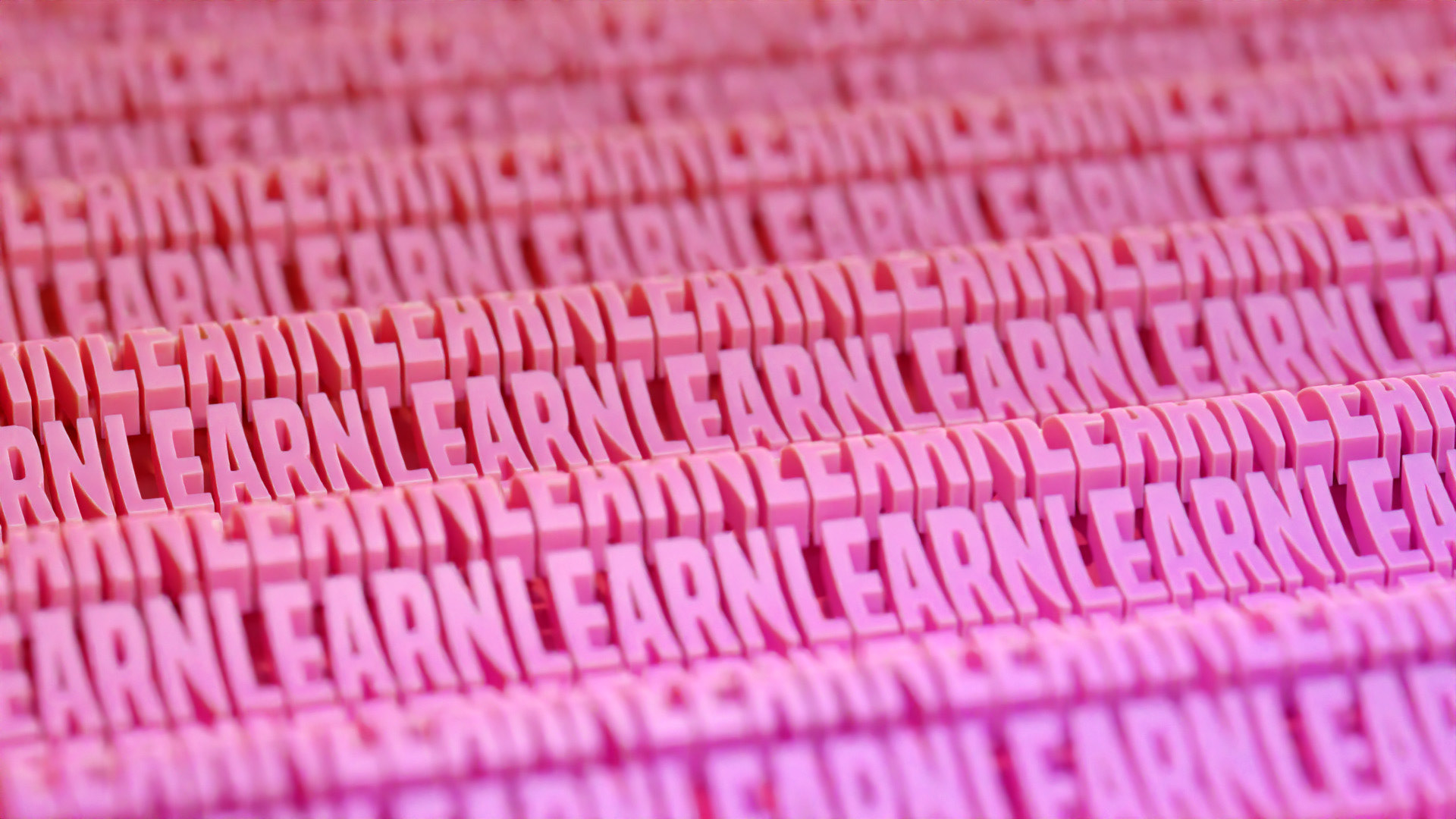
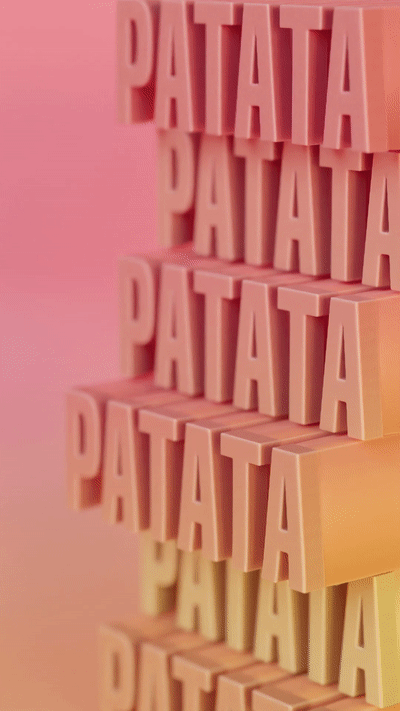
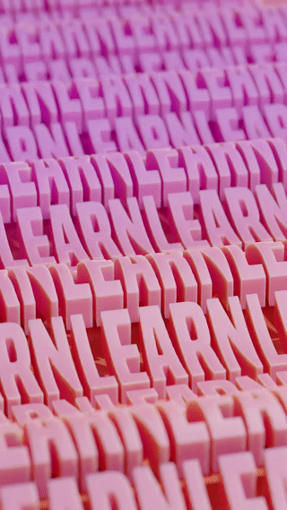
Exploration is at the heart of this project and led us to interesting places like mixing 2D and 3D text and patterning, or using one letter to create another.
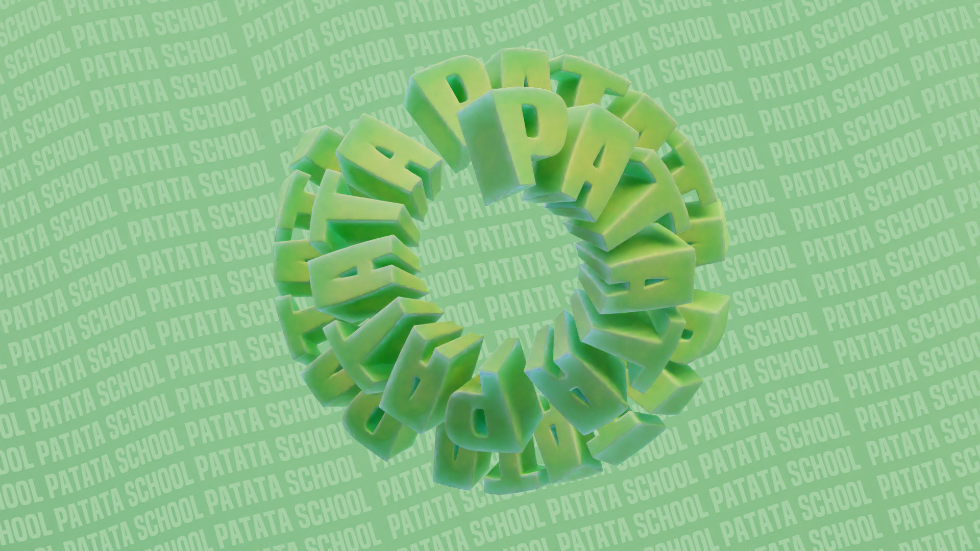

All the animations were created and rendered using Blender and we are proud of the deceptive simplicity in their creation. Being efficient with materials, knowledgable in lighting, and conscious of render times, we have created previously-unexplored Typography Motion and an entire course at PatataSchool.com teaching the process from start to finish.
More than simply technical ability or computer power, we firmly believe - and want to spread the message - that the important part of 3D design is the ideas and the execution.
It's amazing to see how one idea can start a chain reaction and turn into a full exploration that creates unique results. The value is in the intention behind the work and that's what we emphasise at Patata School.

As well as the necessary techniques, this course teaches you how to think like a Motion Designer and bring your own ideas to life. We encourage you to go beyond the course and use your new-found learning to create whatever you imagine. You'll have all the tools you need to do so after completing our course.


As this series of Typomotion repeats in all its different forms: