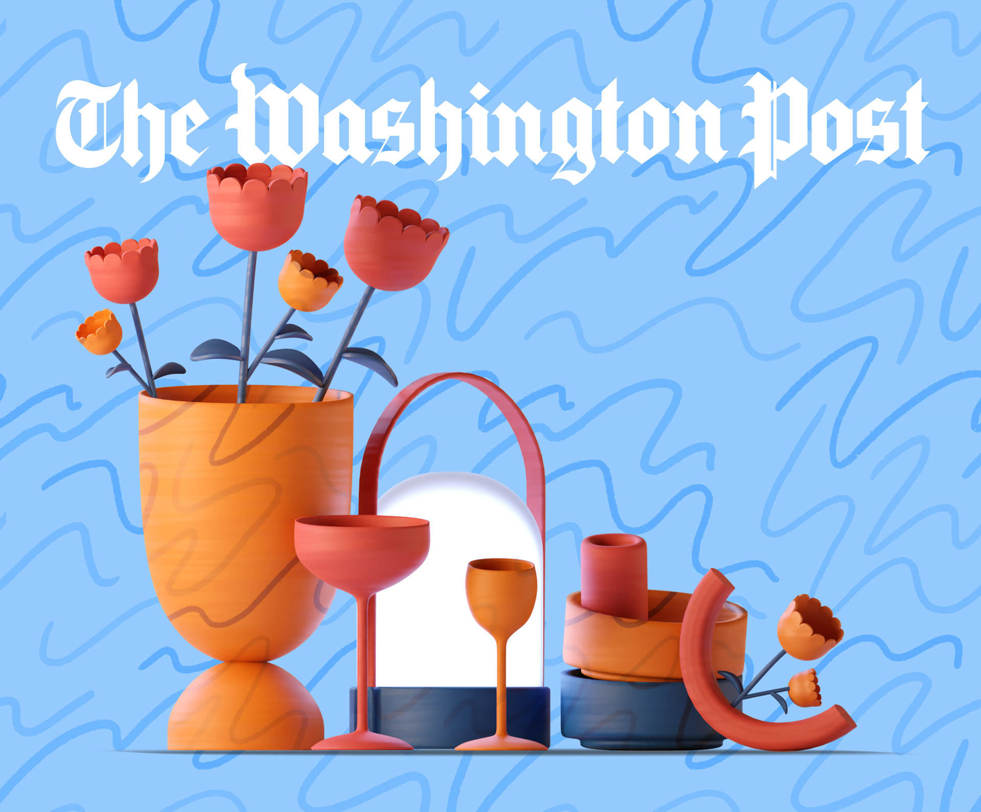
We were invited by The Washington Post to create a series of editorial illustrations for their
2023 Holiday Gift Guide.
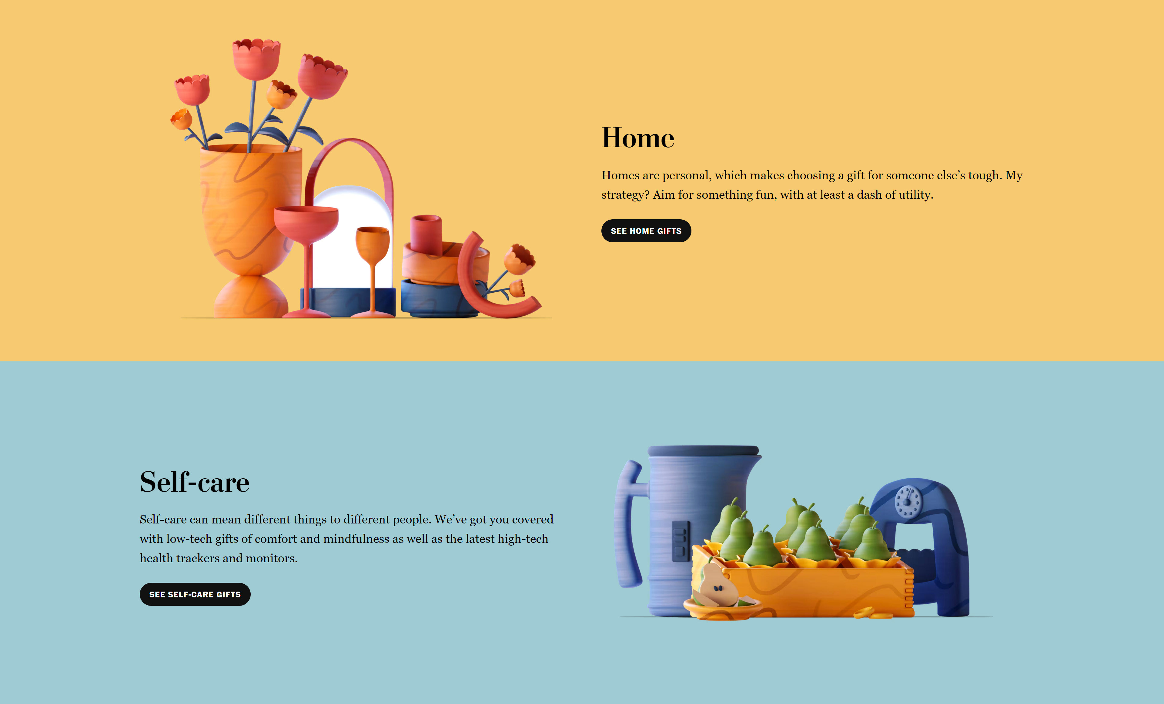
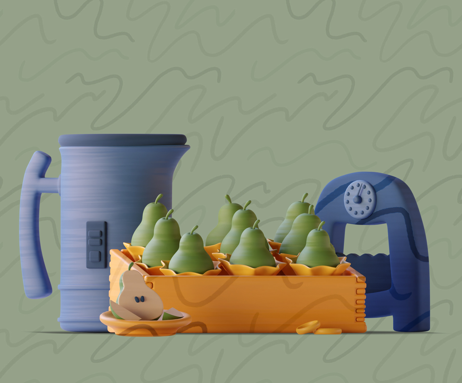
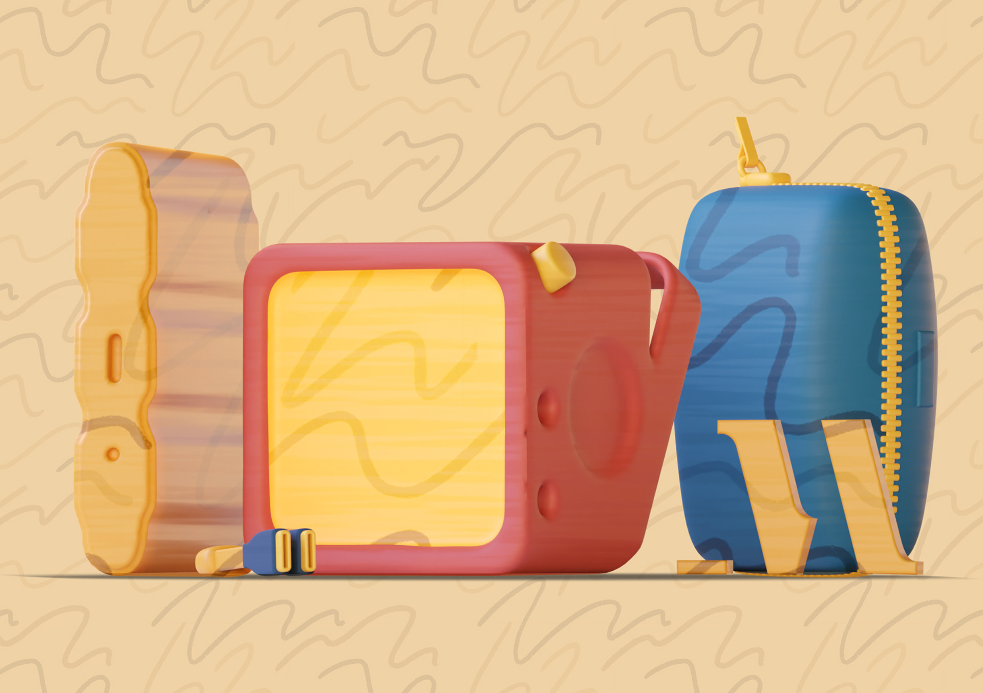
Exploring a still-life style with 2D and 3D elements combined, the series plays with the themes of each article section in a different way but with a common thread running through.
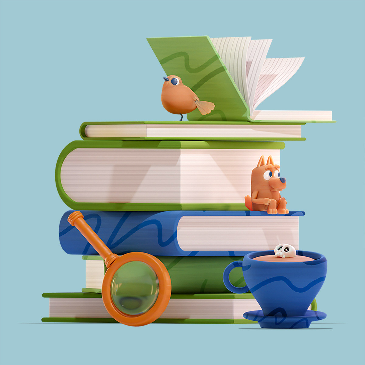
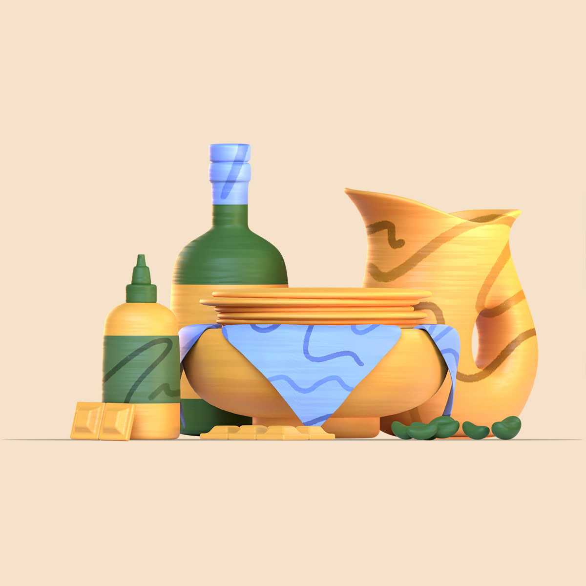


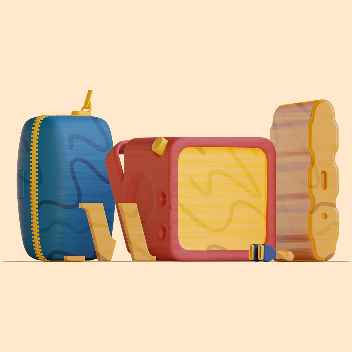

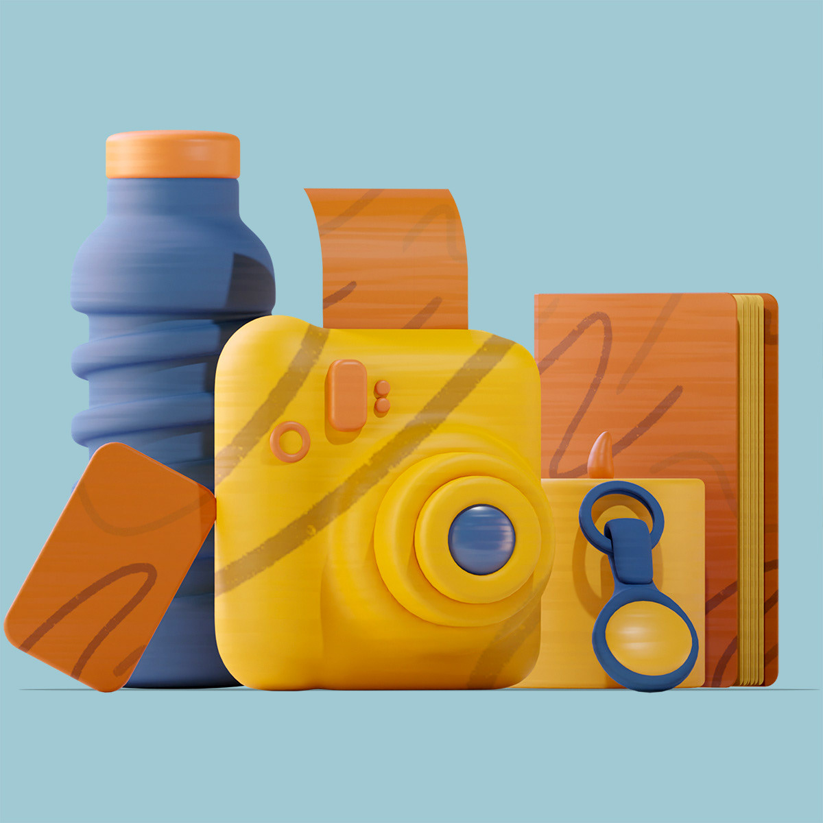
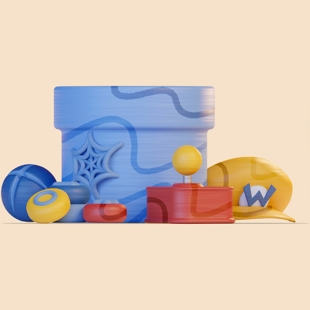
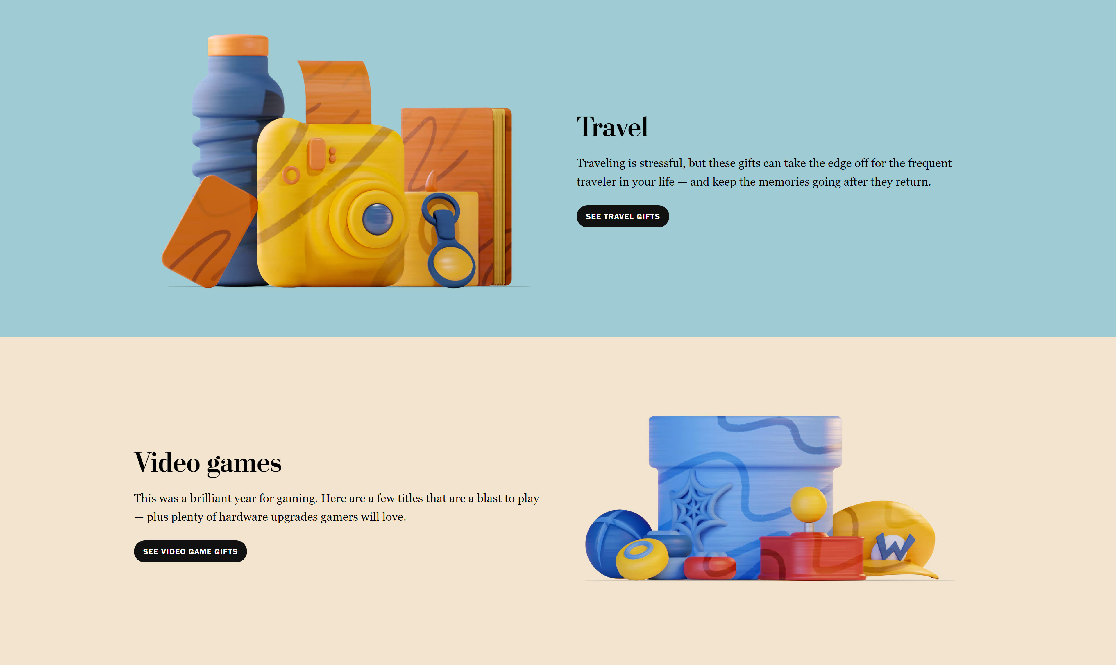


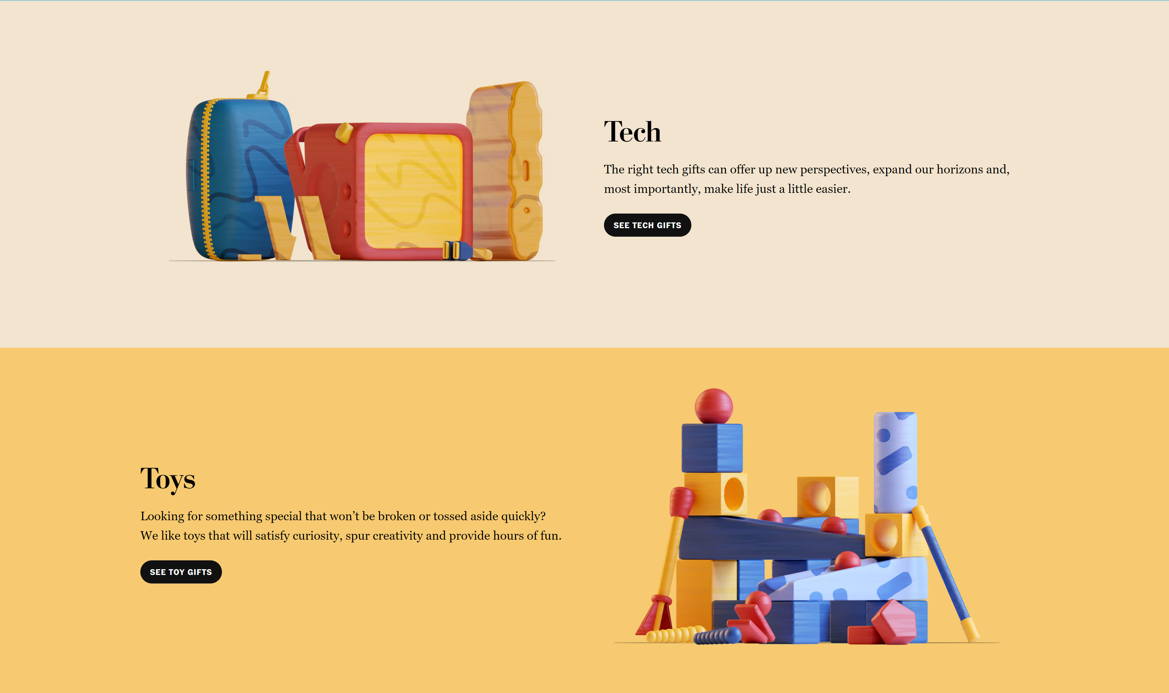
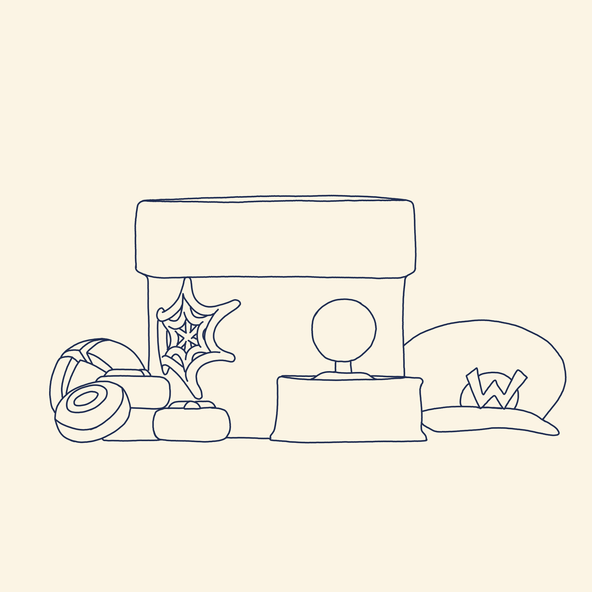
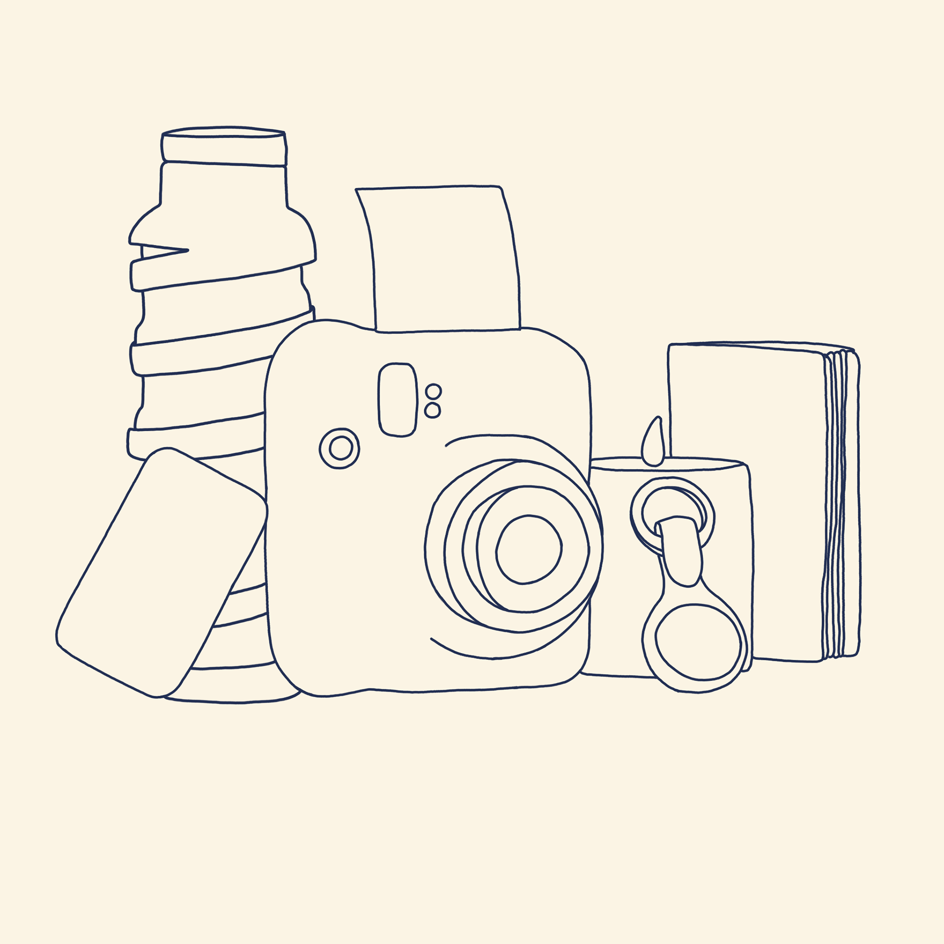
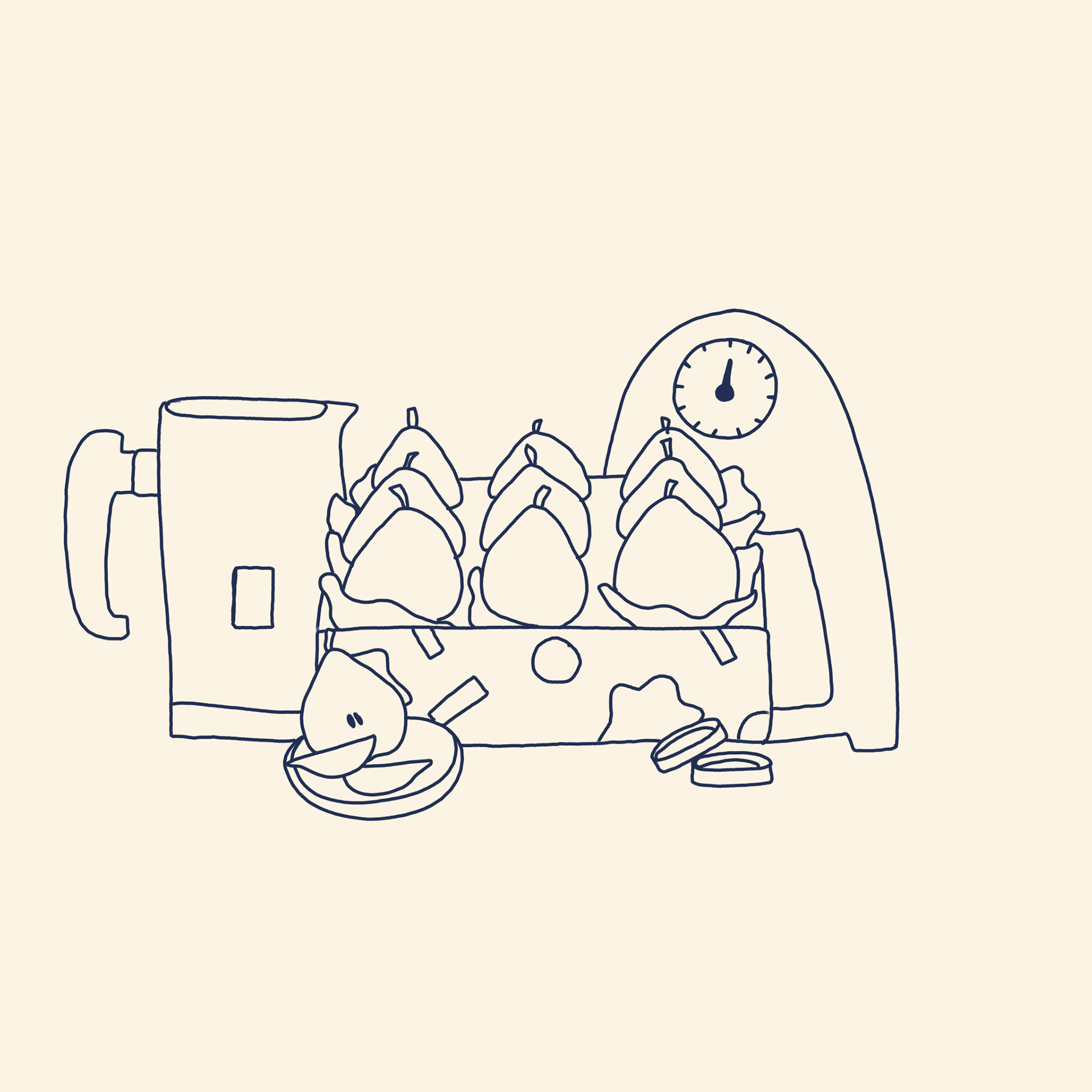
The idea behind the approach was to illustrate the article directly and portray the gift ideas in a novel way; some are more obvious recreations, some more abstract, but each theme is immediately identifiable; Books, Food, Home, Self Care, Tech, Toys, Travel, Video Games.
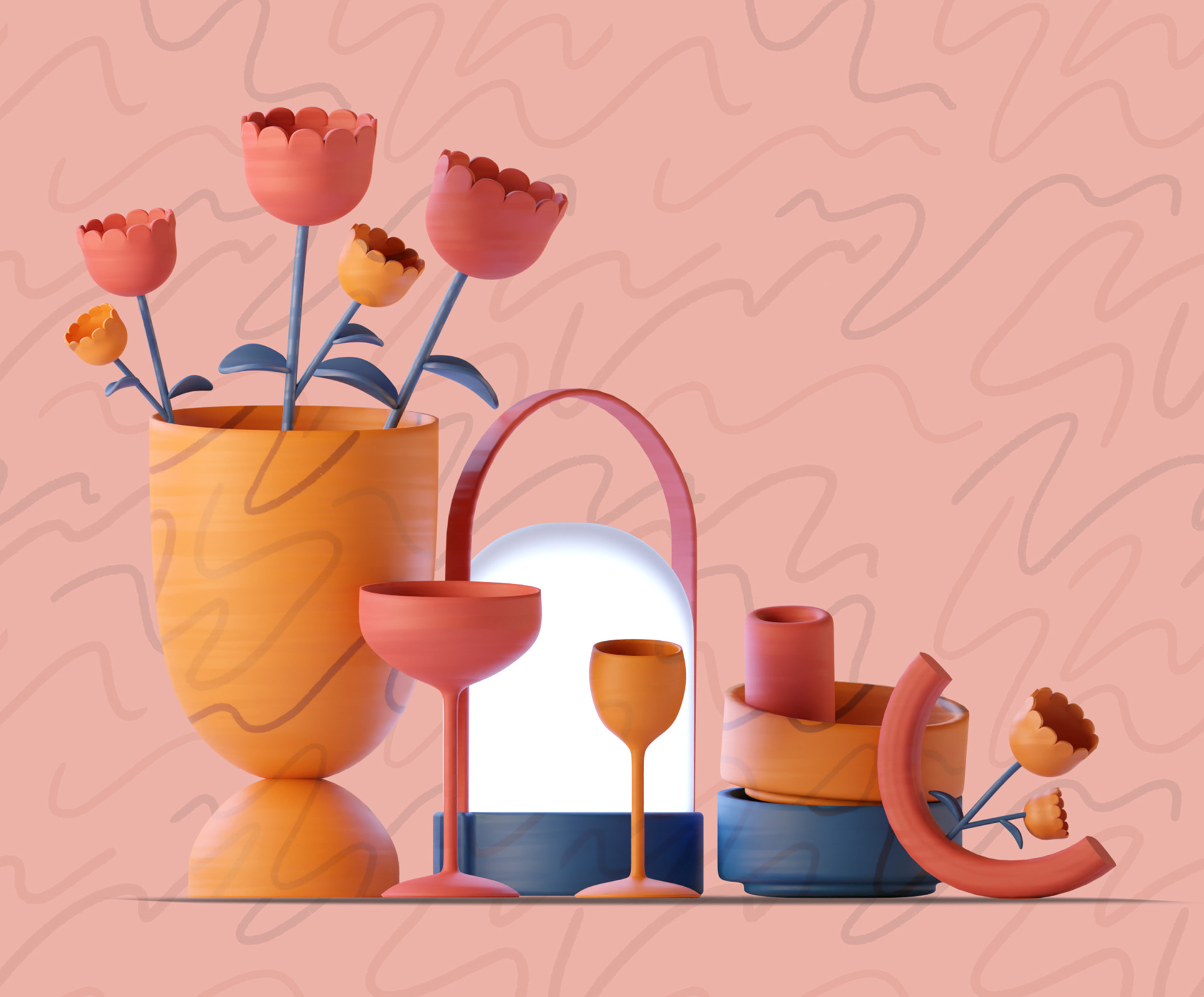


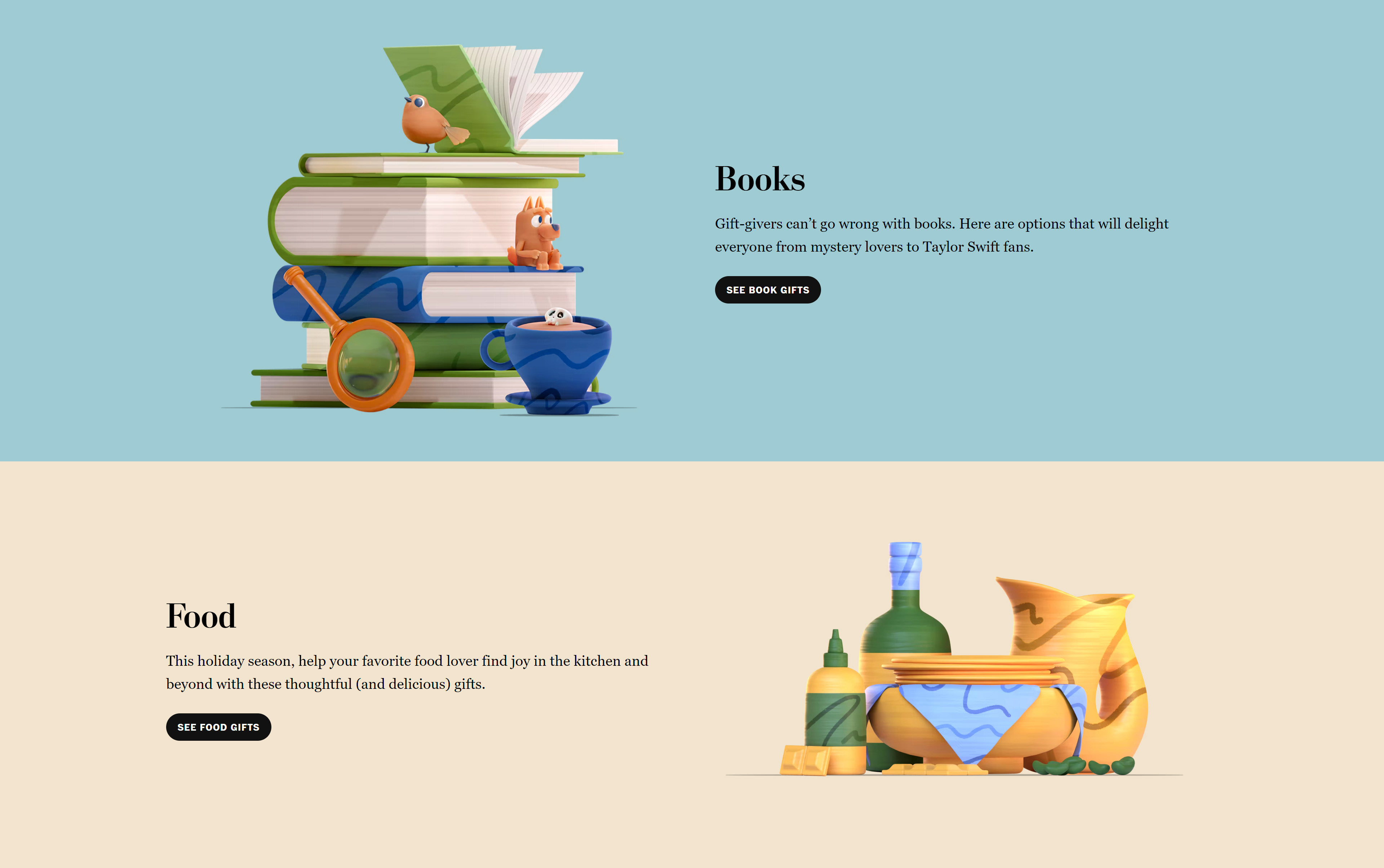
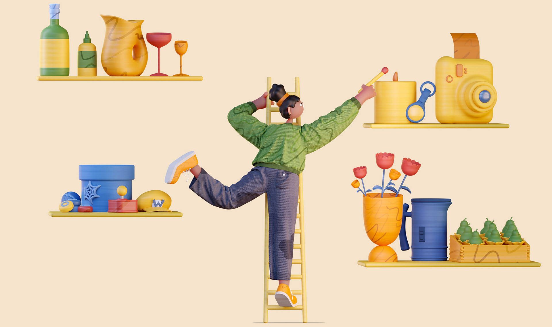
Whilst the elements are all created in 3D, we wanted to give a more tactile feel to them and hint of confusion to the illustration as to how it was created. Consistent texturing gives an almost oil-painted effect, while hand-drawn patterns are projected onto the 3D models to make them feel more tangible and playful.
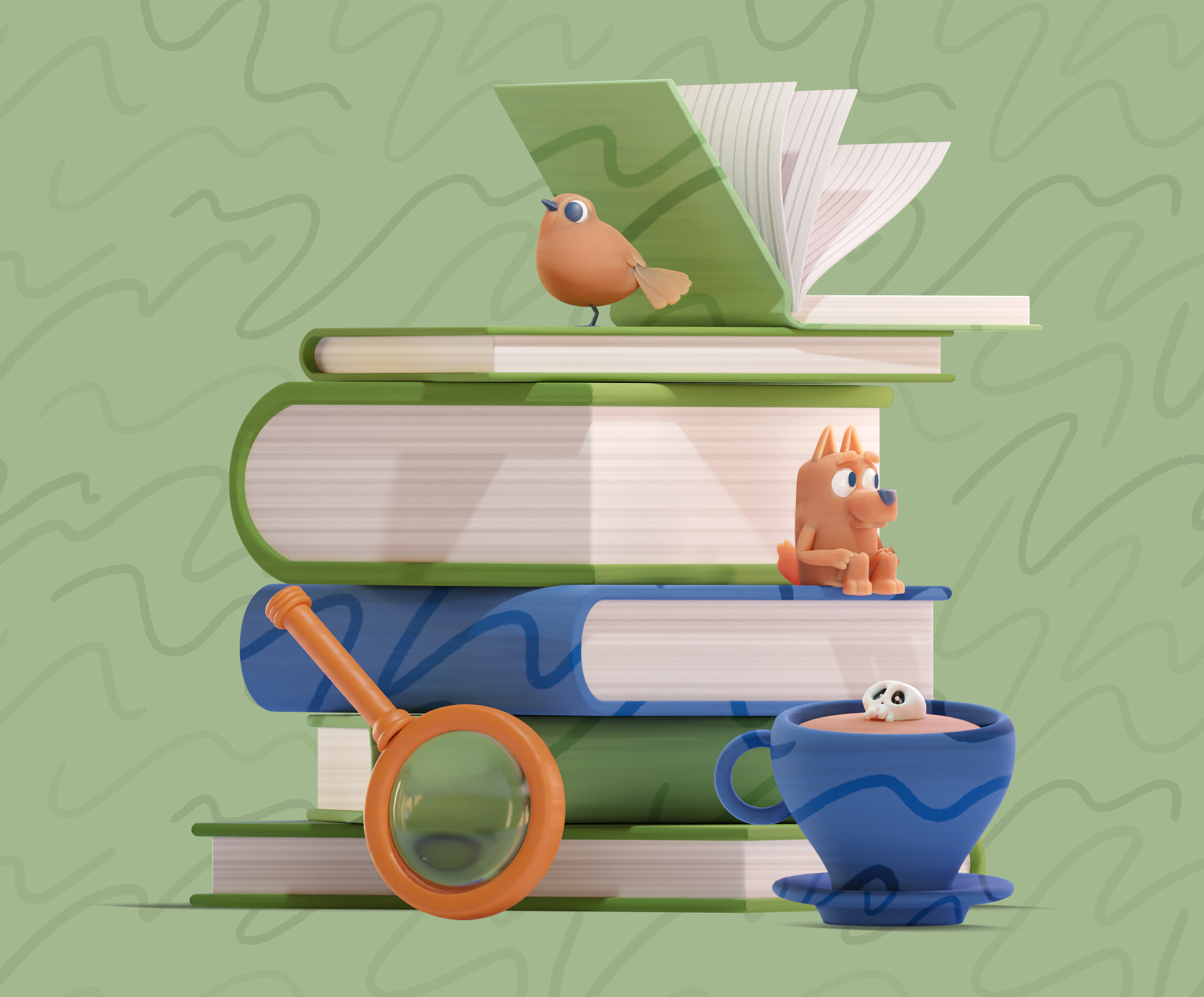
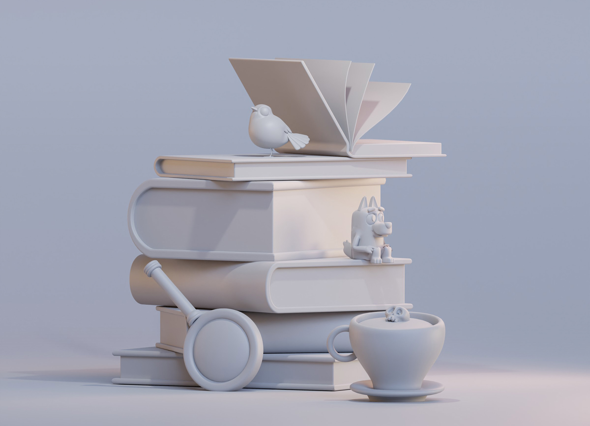
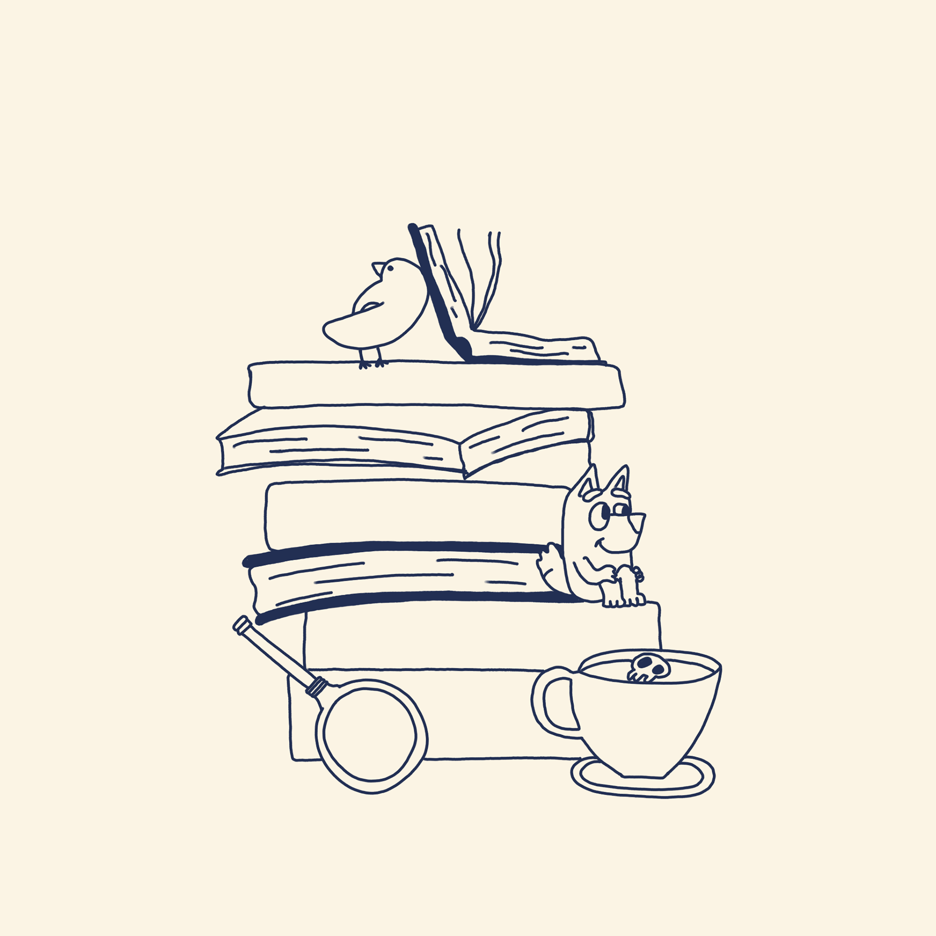
Each illustration in the series makes reference to the article in a more or less direct way. We particularly enjoy this example of the Books selection; our stack of books includes a magnifying glass and skull in a cup of tea for the murder mystery recommendations, while we have a bird sat atop the pile for a bird-watching guide, and the well-known character Bluey is tucked among the books.

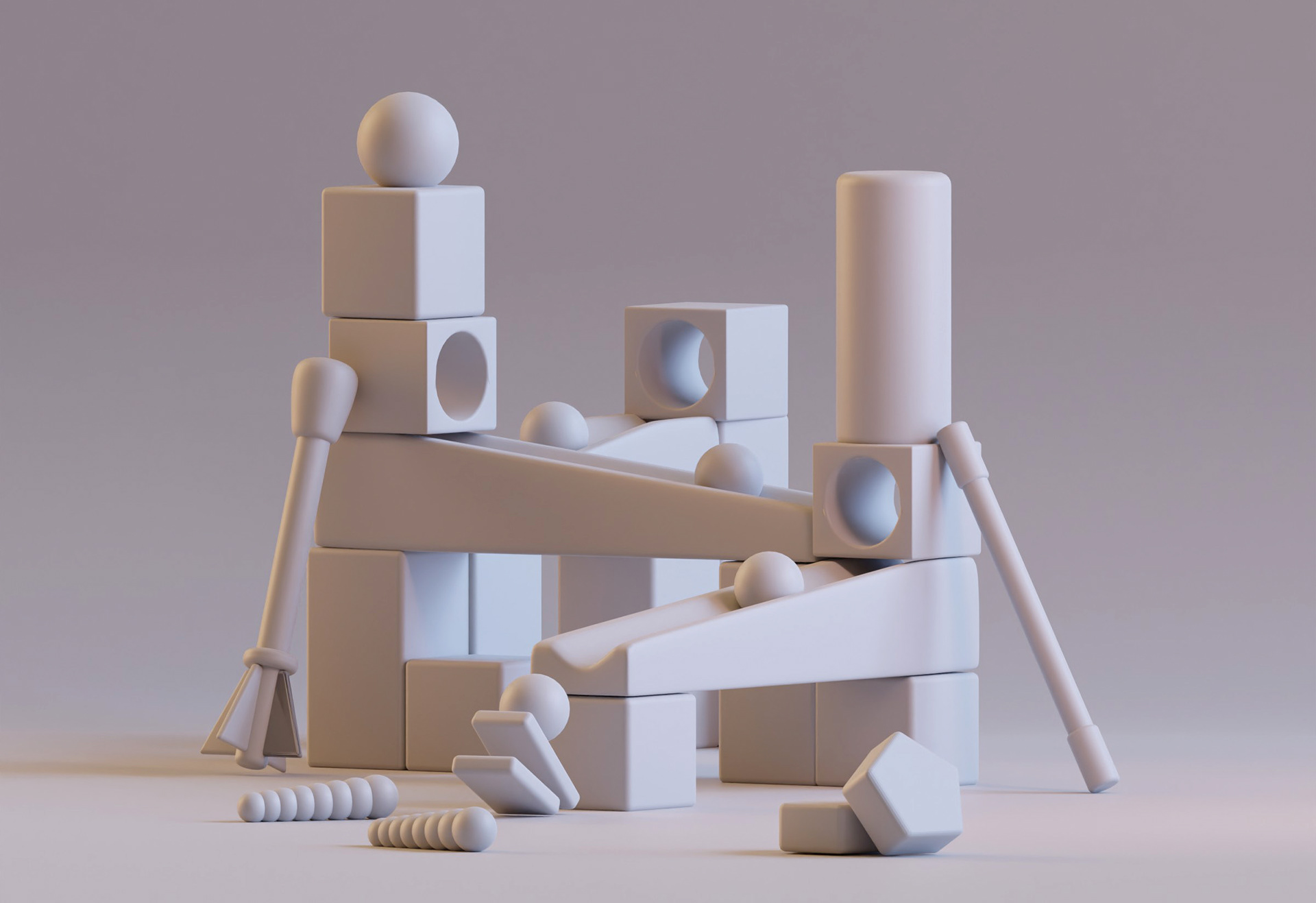
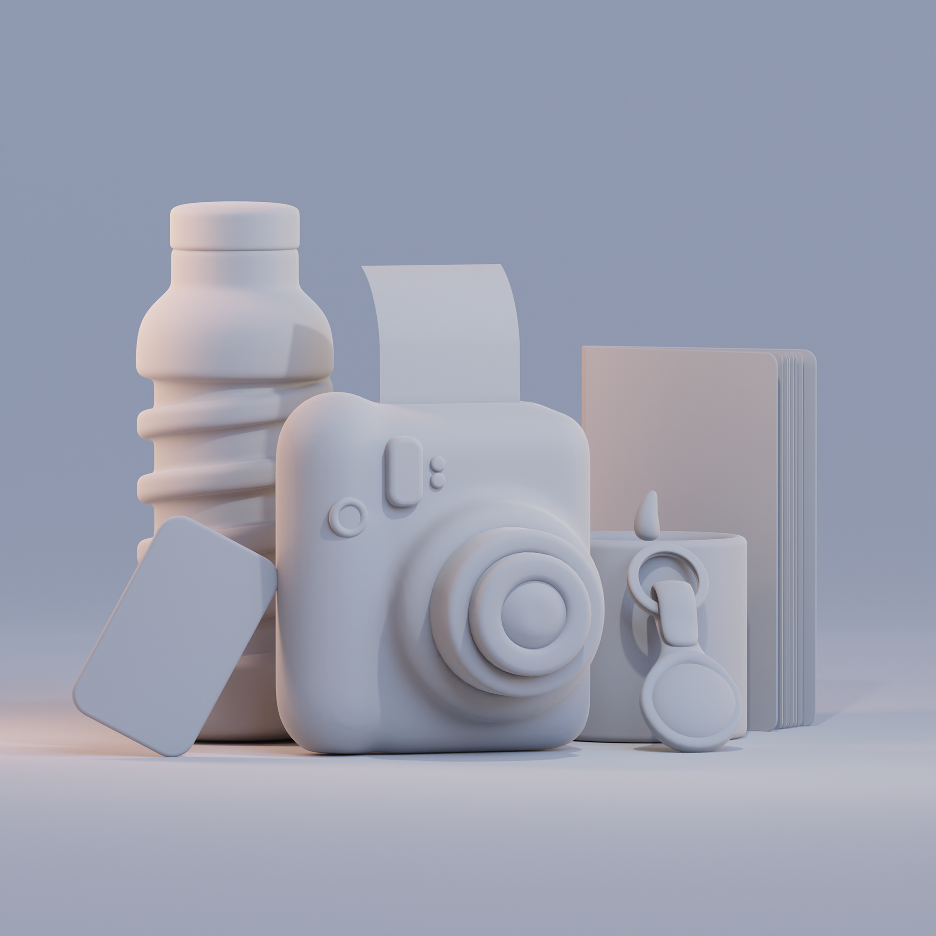
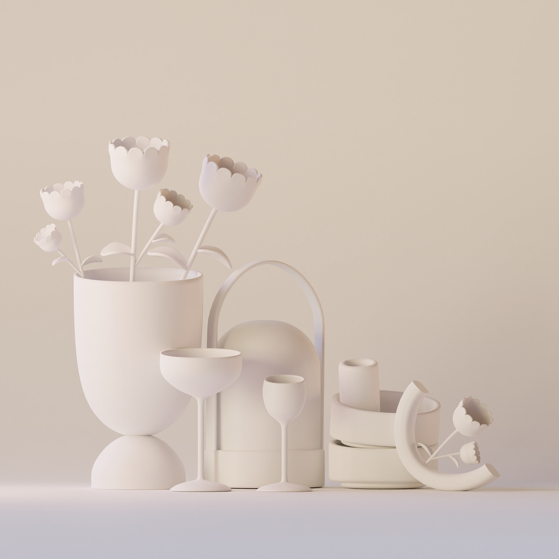
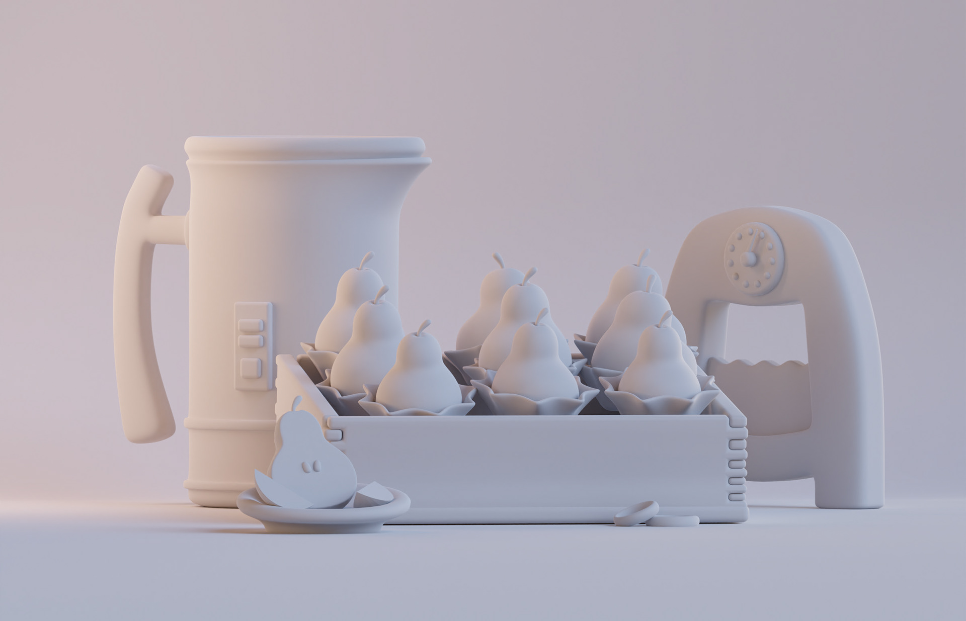
Before adding colour and texture, it helps to see the series in black and white and get a consistent feel across the lighting, composition and shapes.

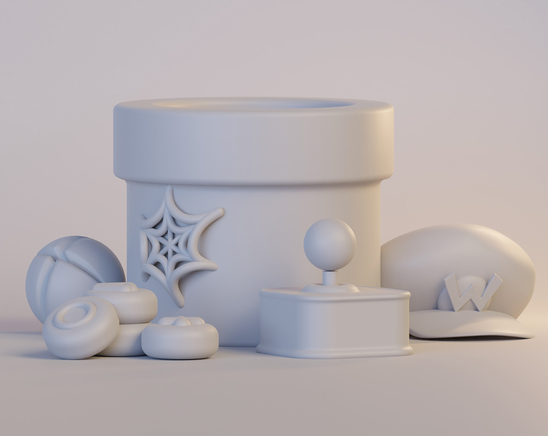
With this project in particular, having so many different elements with varied product designs, it's important to check that objects work together and don't feel disjointed.
Hand-modelling every element with consistency in technique helped us to achieve the final look of a series of still-life illustrations.
A reduced colour palette is always a challenge and in this case we wanted each image to feel definitive and self-contained while keeping in line with the series. We love balancing the colours and seeing the set of illustrations as a whole.
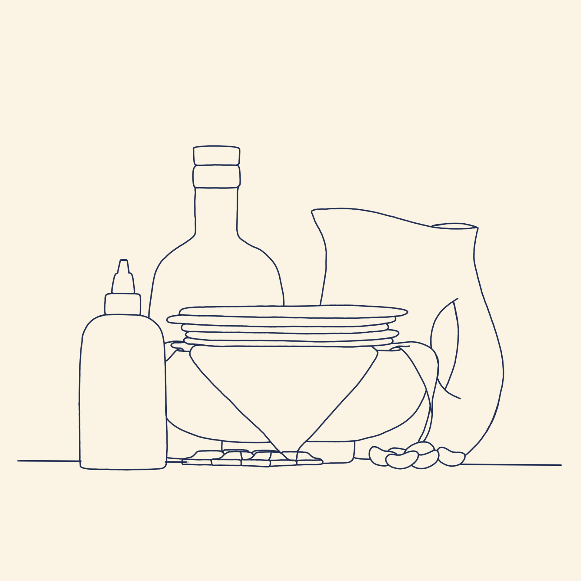
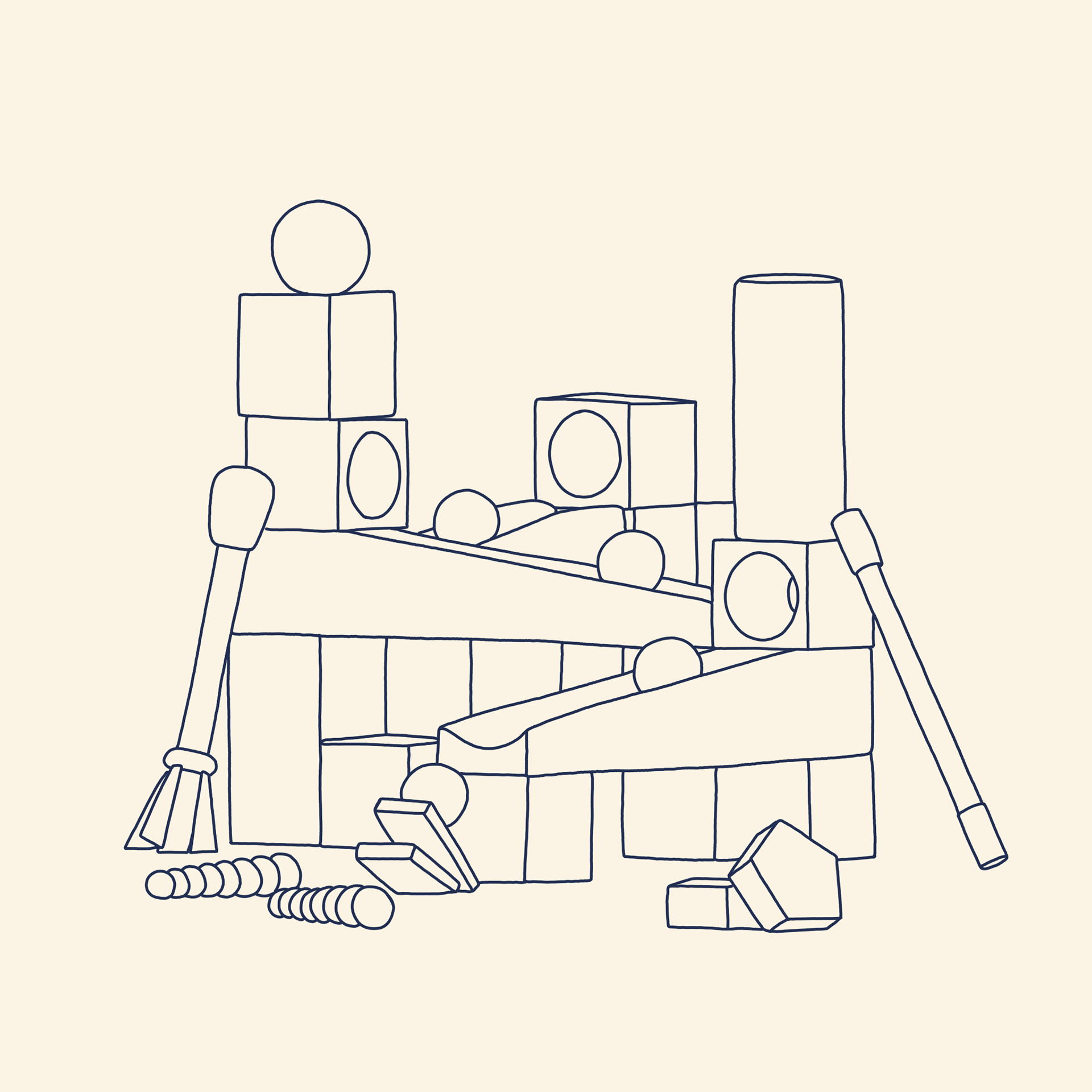
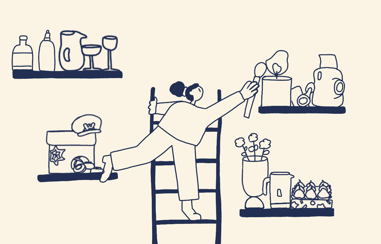
As with every project, this one began with 2D sketches to get an understanding of the composition and how the illustrations work as a series. We worked to get the same perspective in each image and the arrangement and sizing of elements feels consistent across the set.


The main illustration also started life as a rough sketch with the idea of a character arranging the products neatly, a hint to 'Santa's workshop' without any obvious reference to Christmas either in the colours or the style.